Passionate about visual identities, editorial design, typography and illustration, Javi tries to find a unique character in each of his projects, through exploration, experimentation and the combination of different analogue and digital techniques.
For collaborations or commissions feel free to email me at info@jvcos.com or contact me on Instagram.
Design
Art Direction
Photography
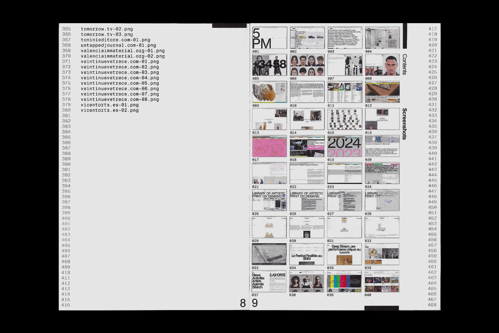
P.001
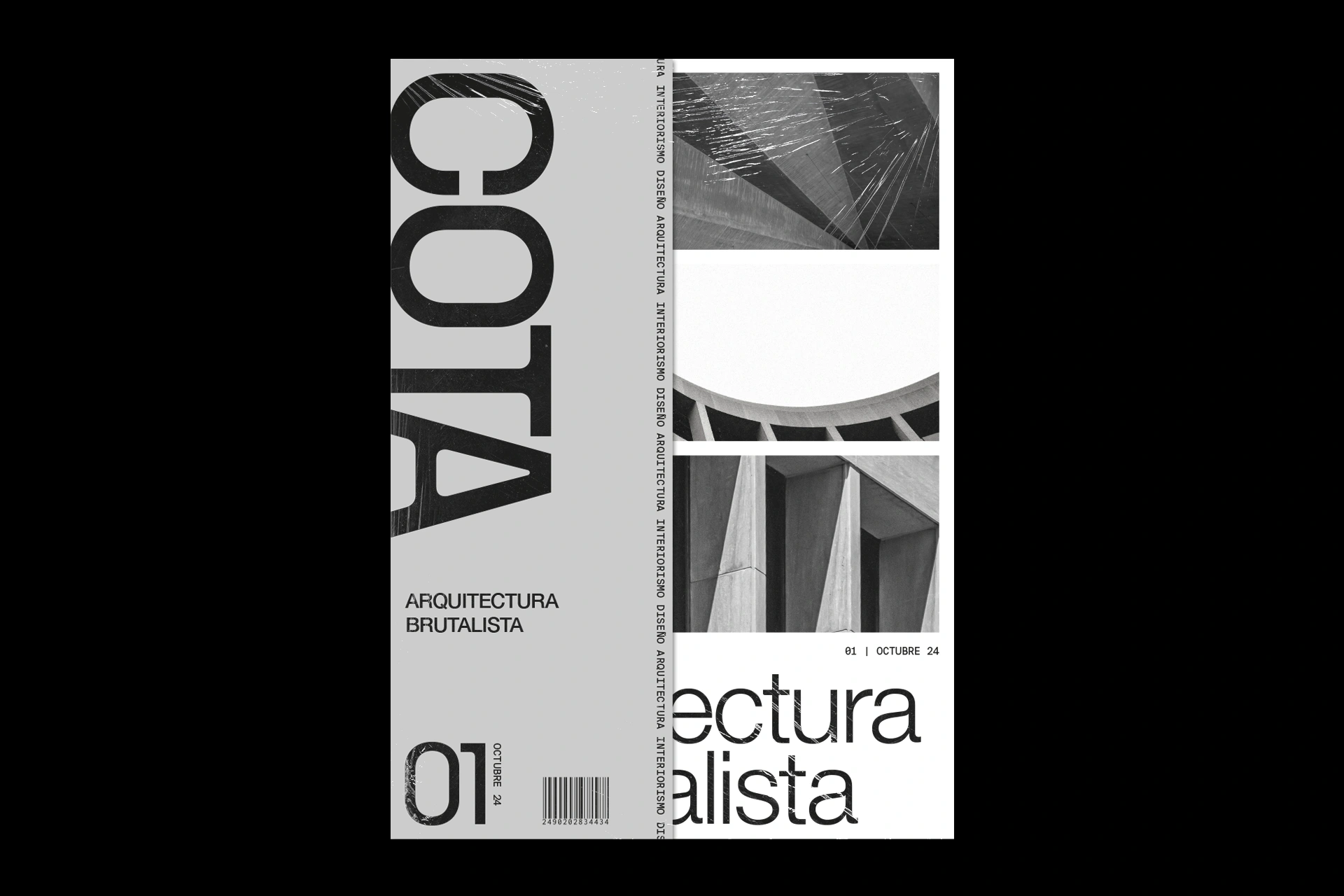
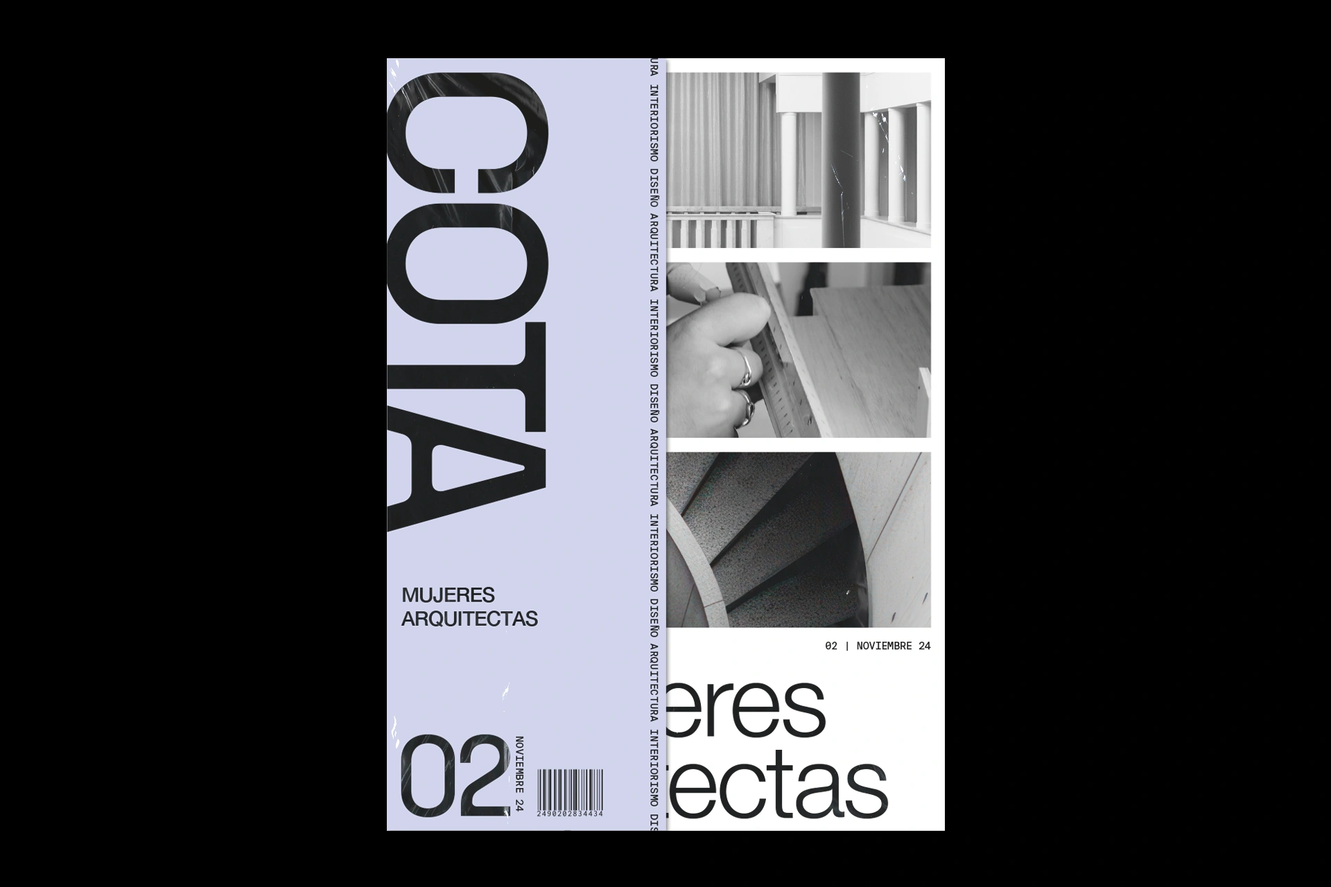
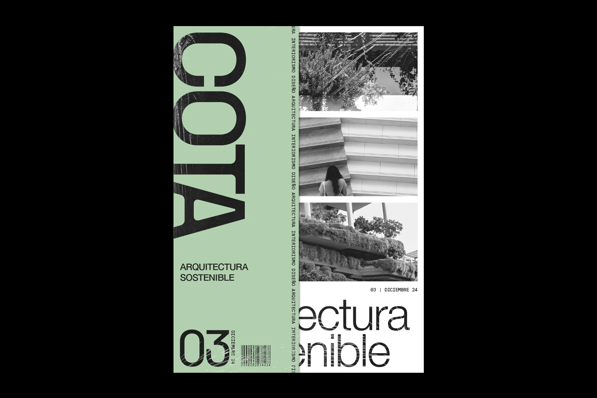
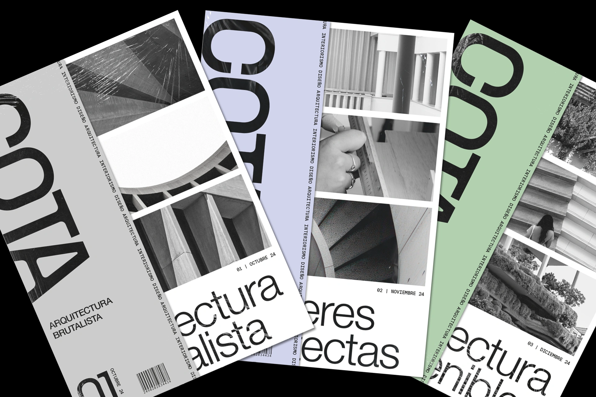
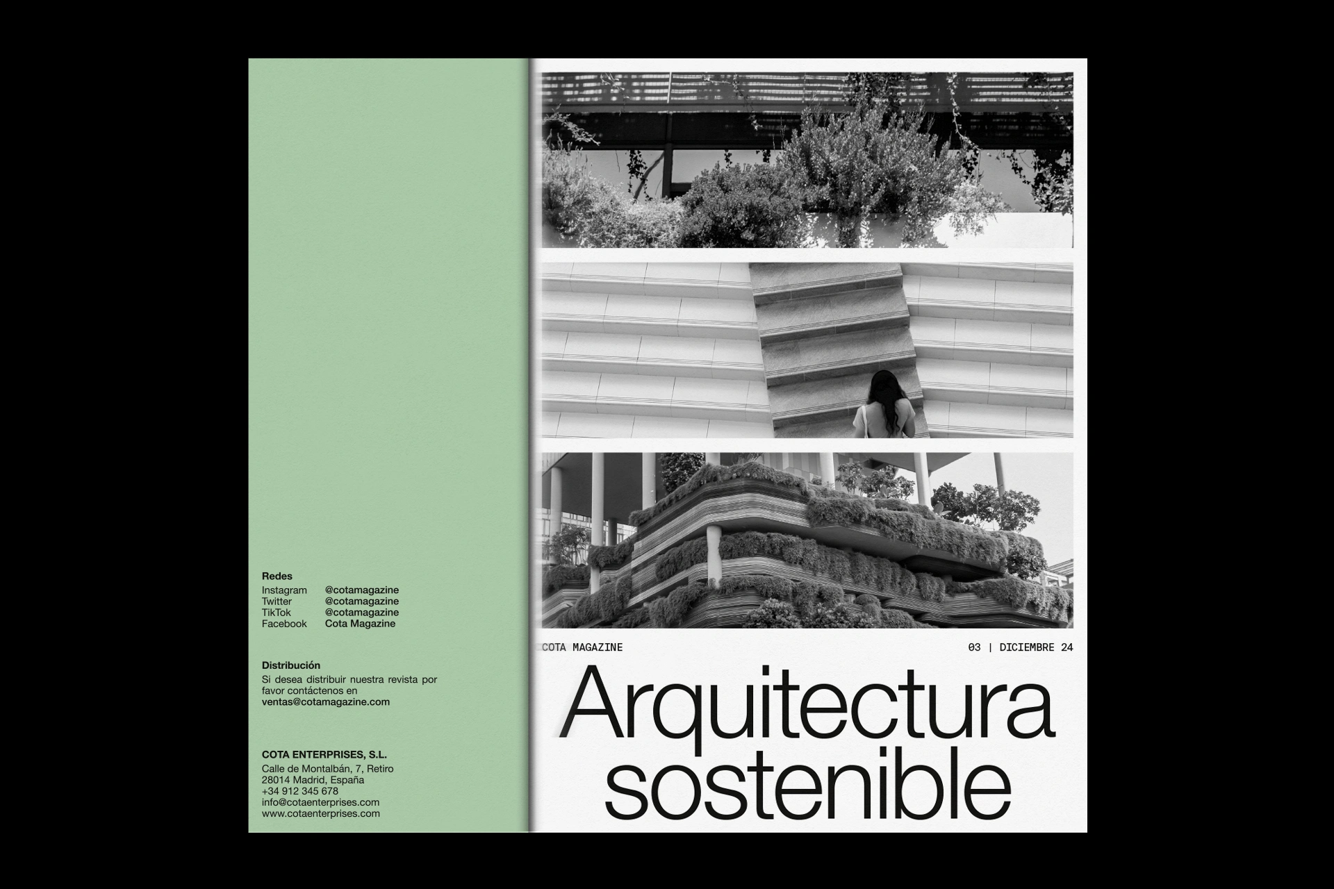
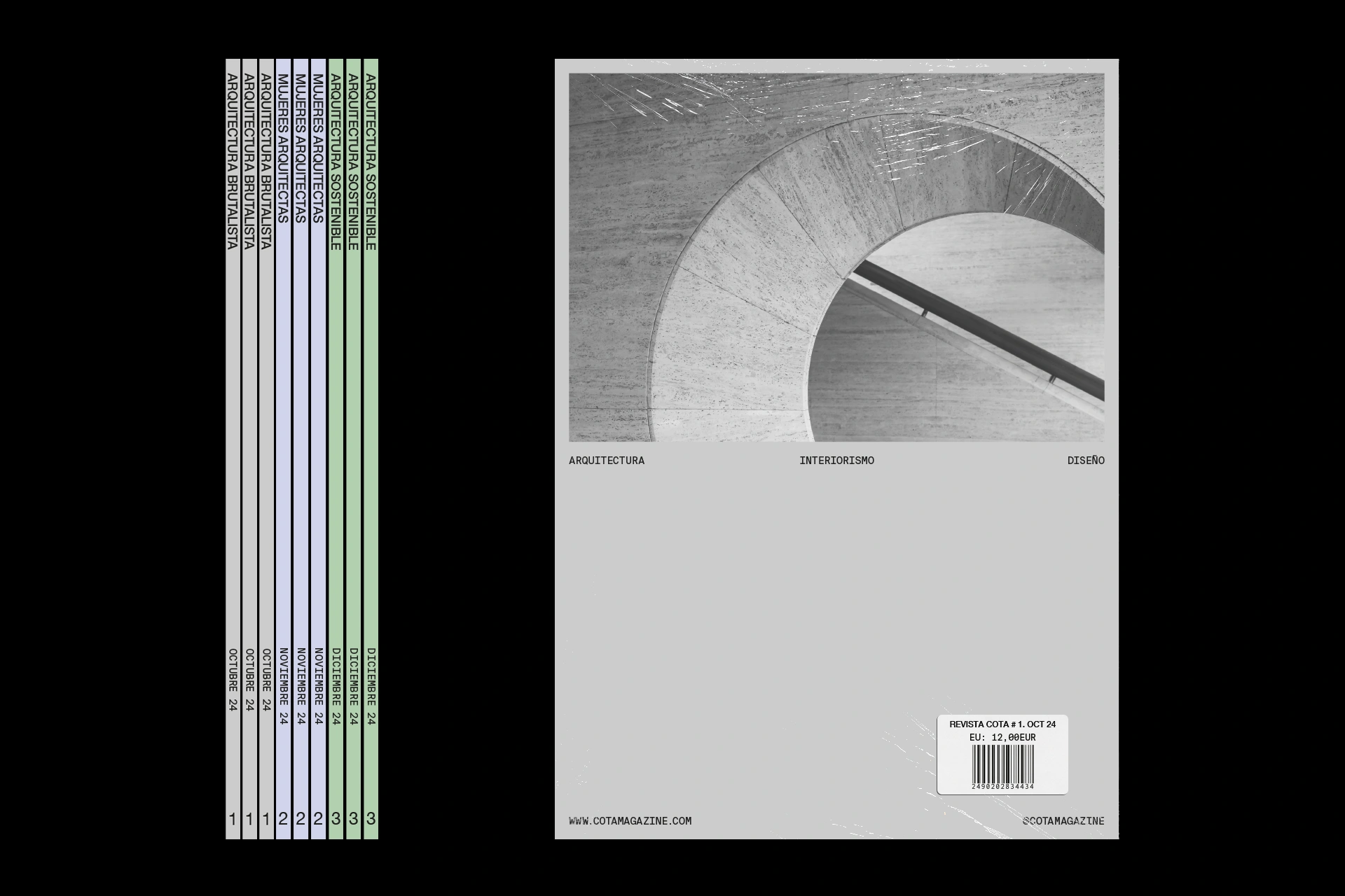
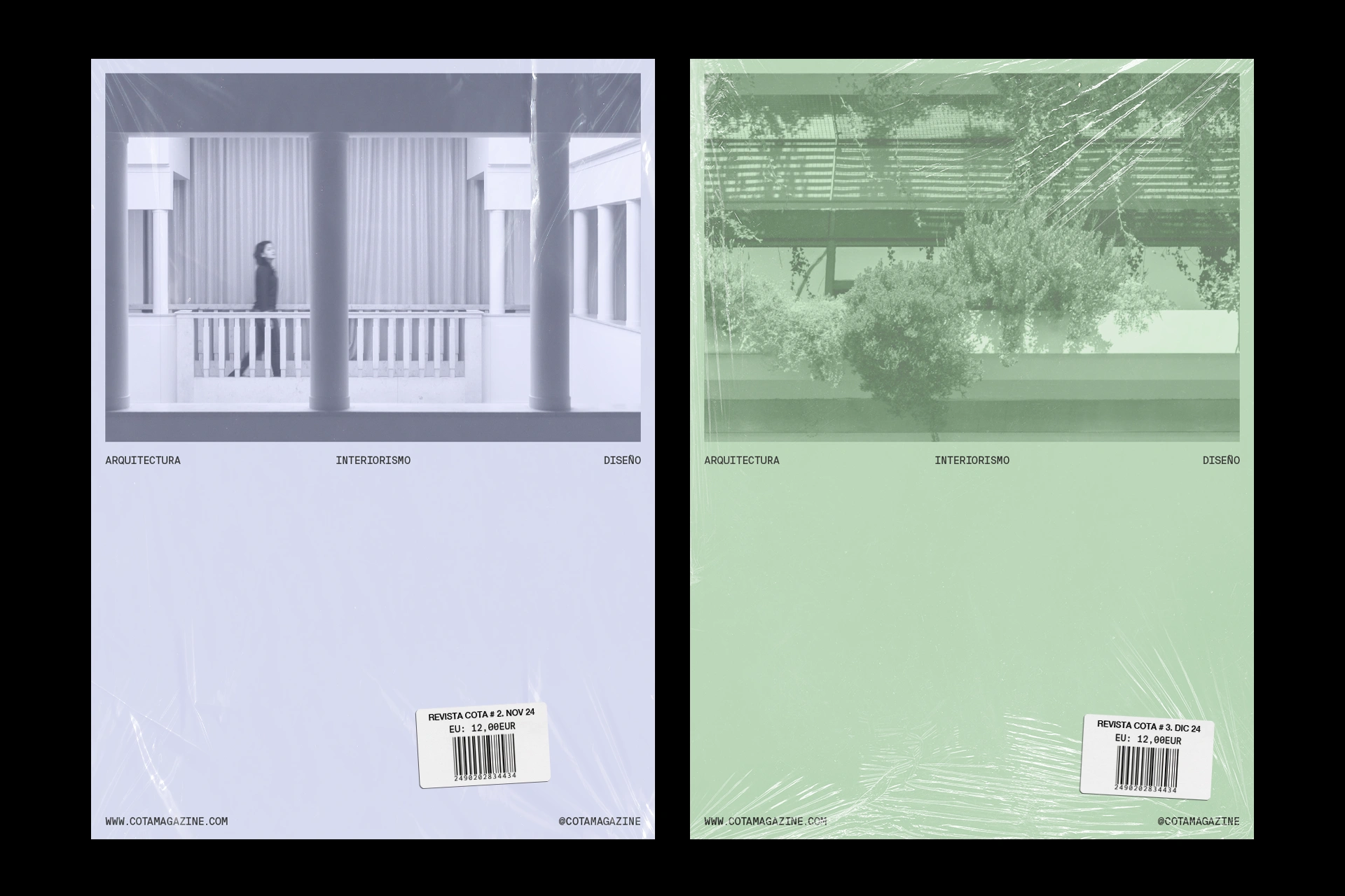
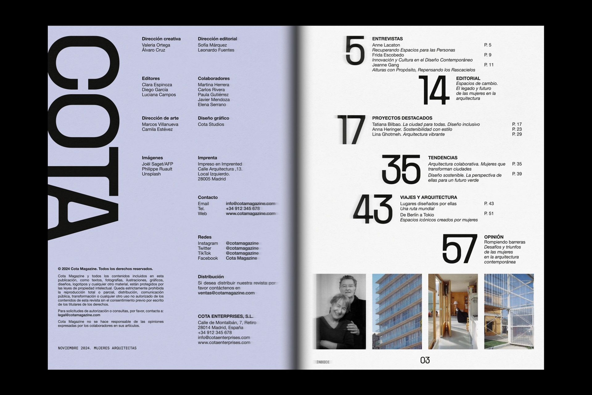
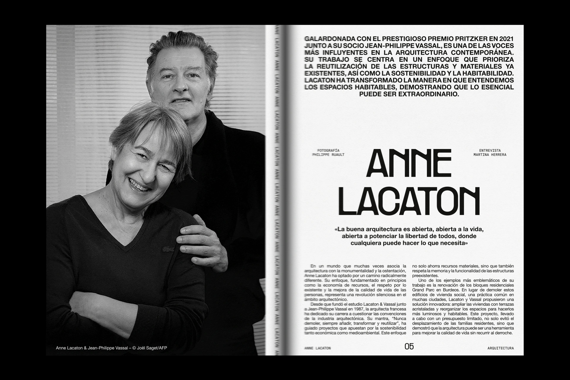
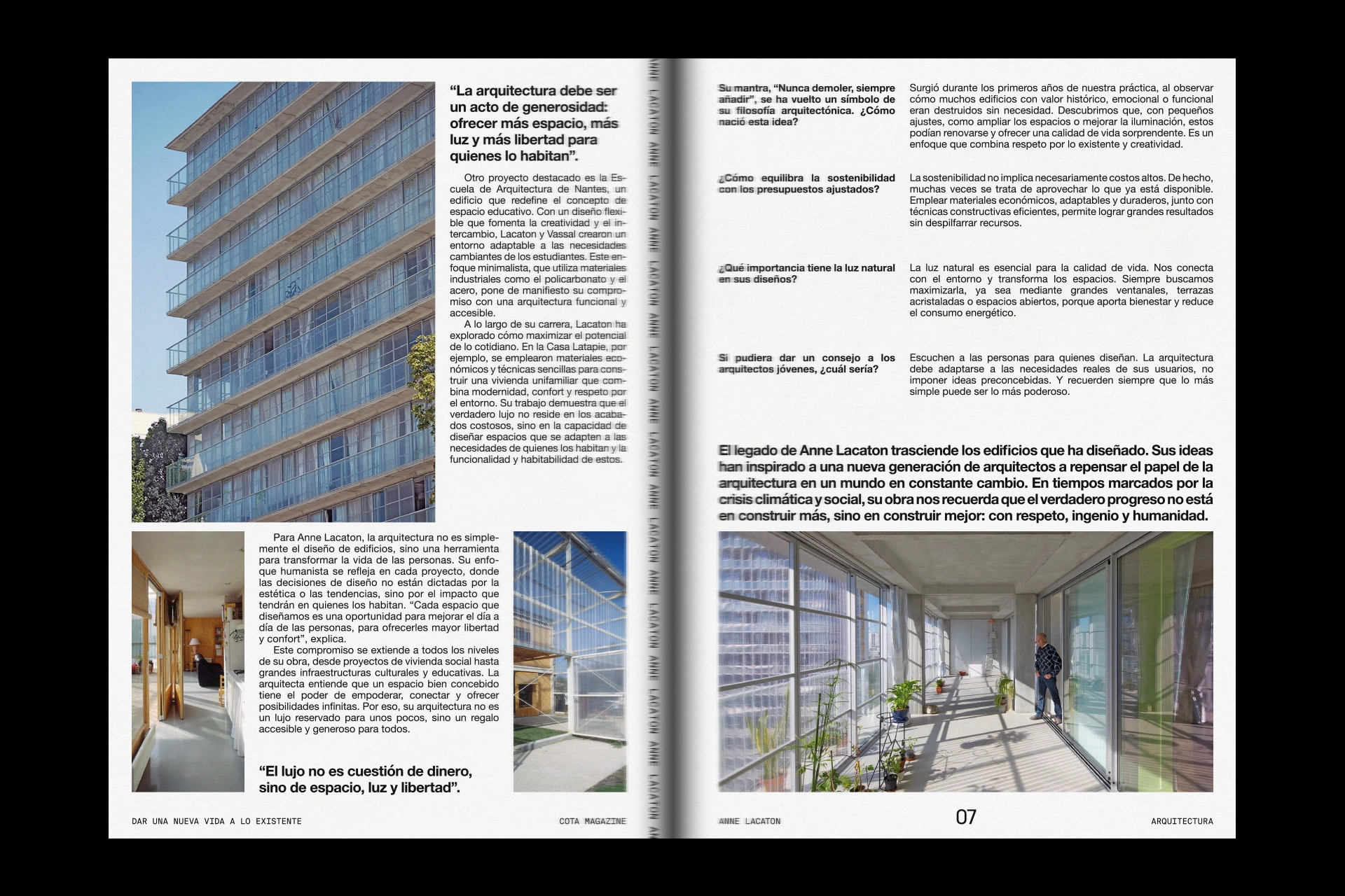
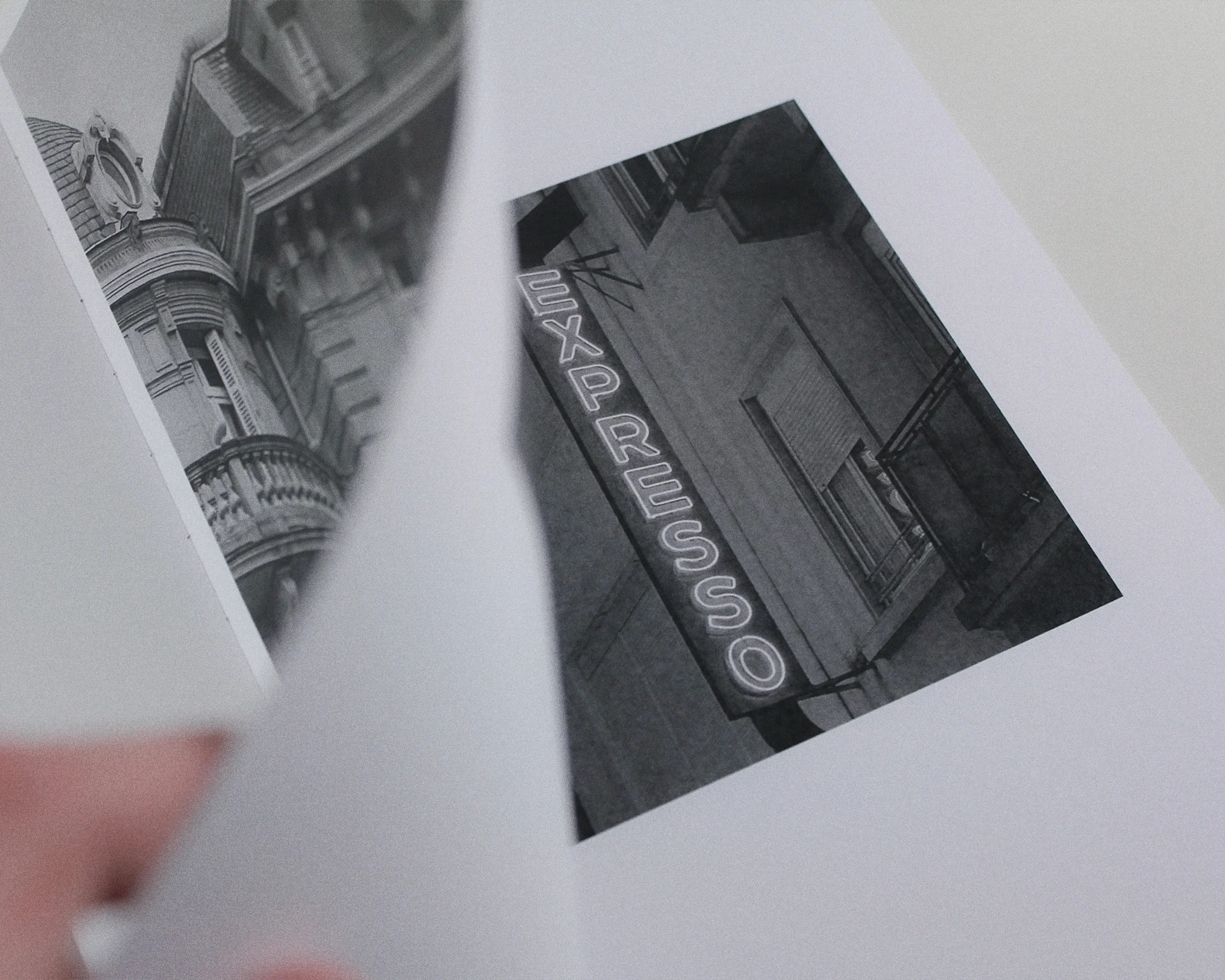
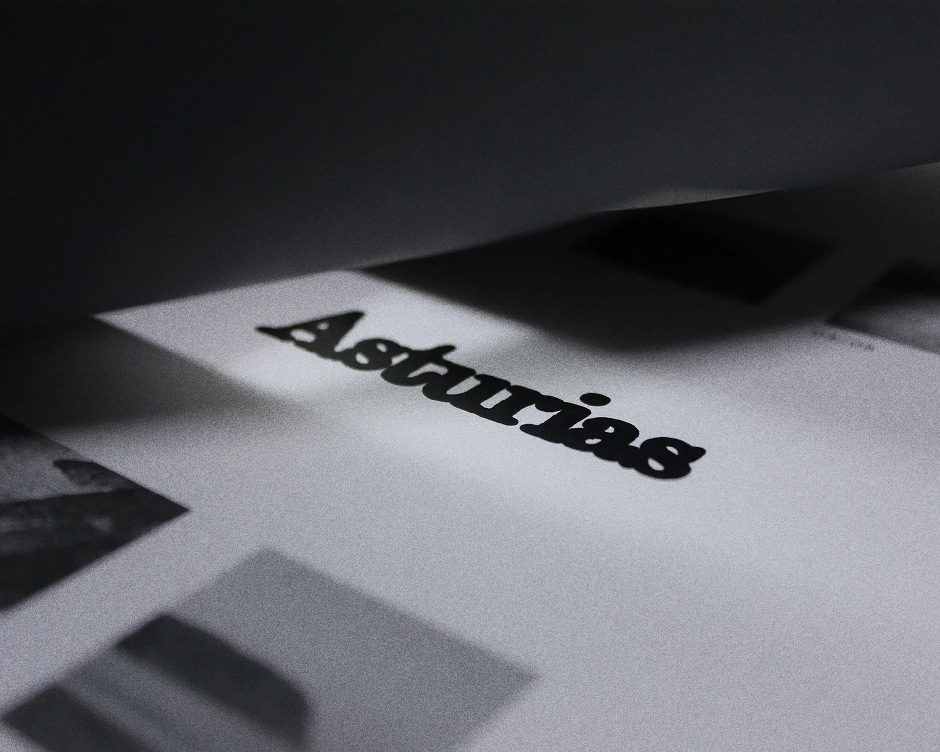
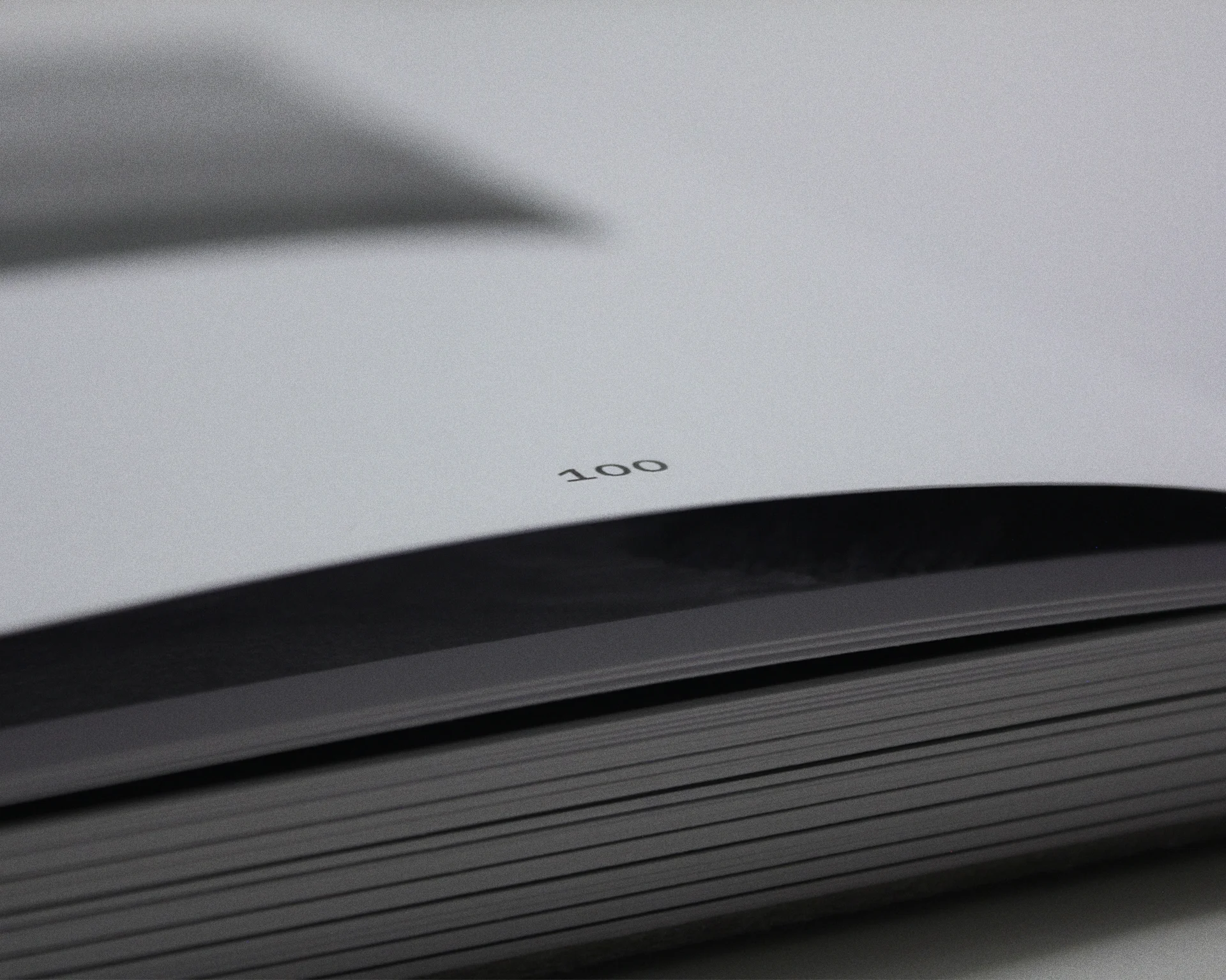
COTA Magazine
[Editorial design]
02.2025
Academic project
Editorial design for COTA magazine, a monthly publication on design, architecture and interior design. The proposed design seeks to differentiate itself from competing magazines and stand out from the rest when displayed in shops through its unique design and layout.
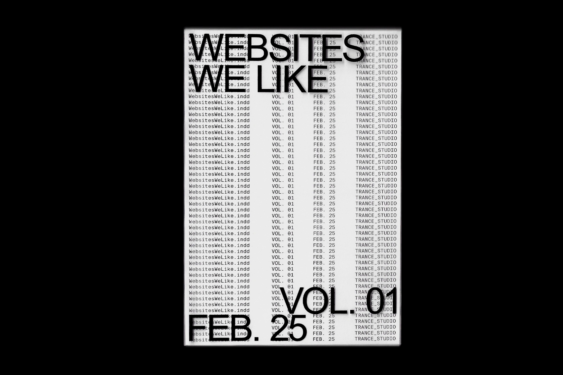
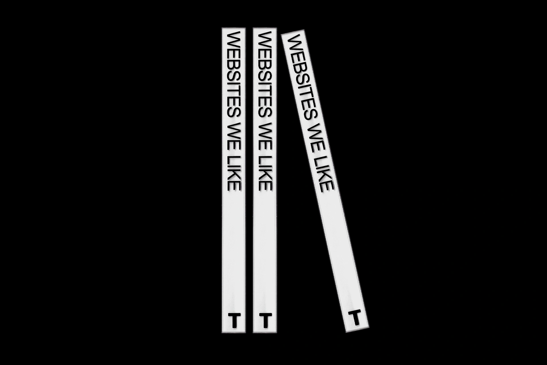
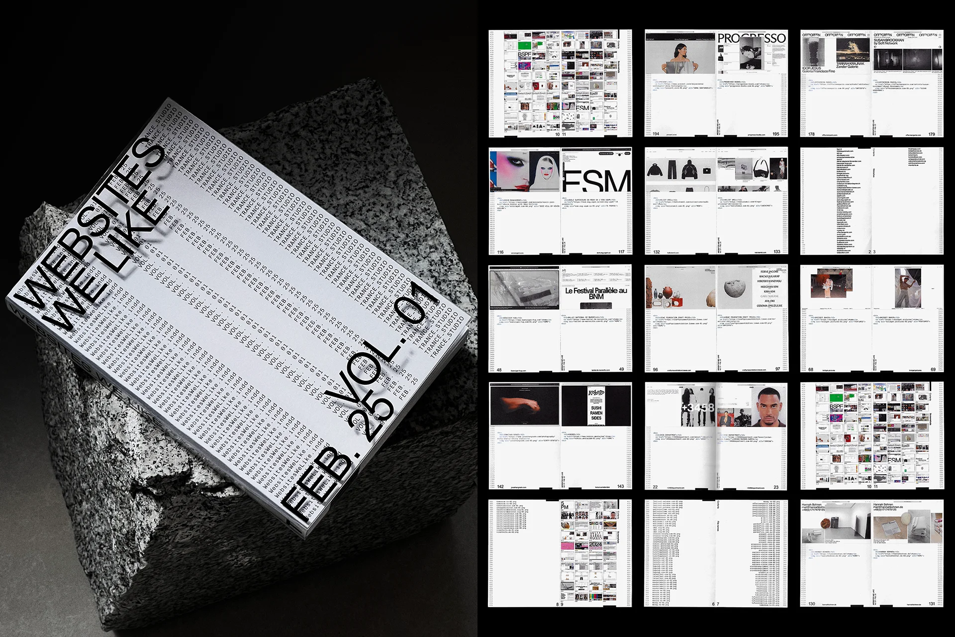
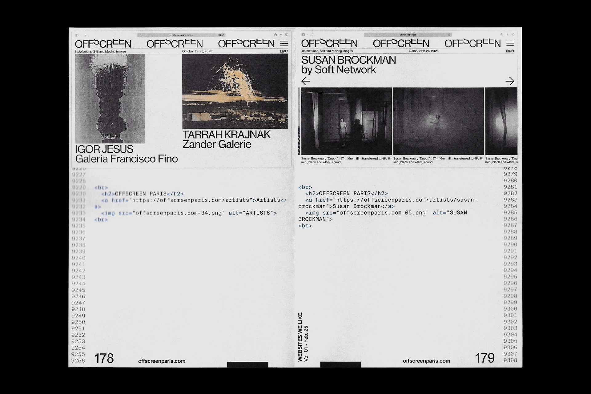
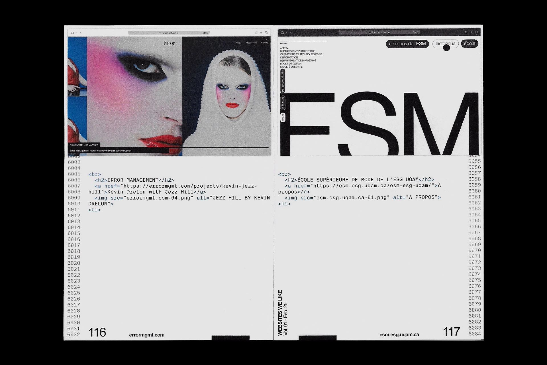
A compilation of 61 outstanding website designs collected in a small book of 12,5 x 18 cm. The book contains 242 digitally printed, hand-sewn and hand-bound pages and a printed PVC cover.
P.003
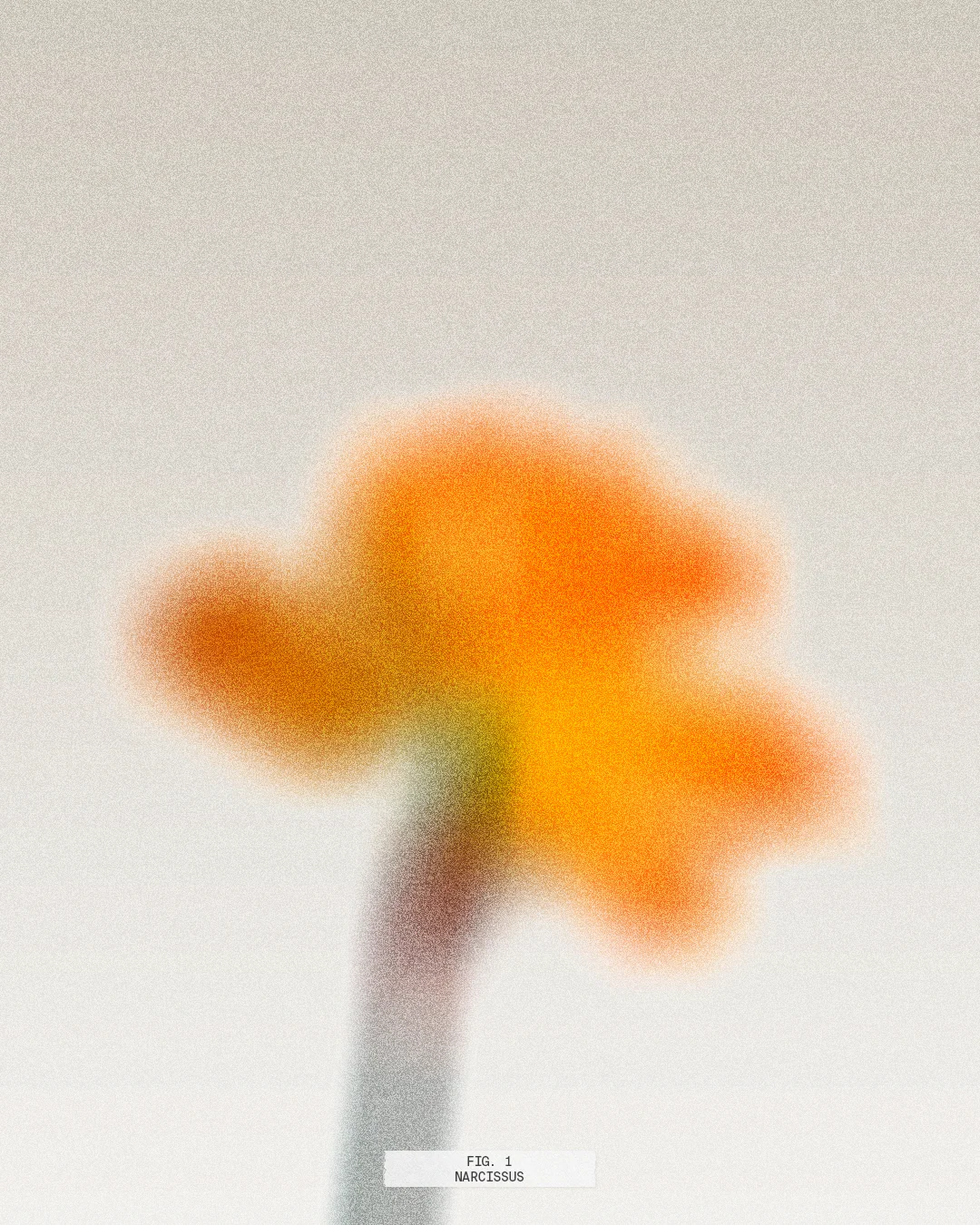
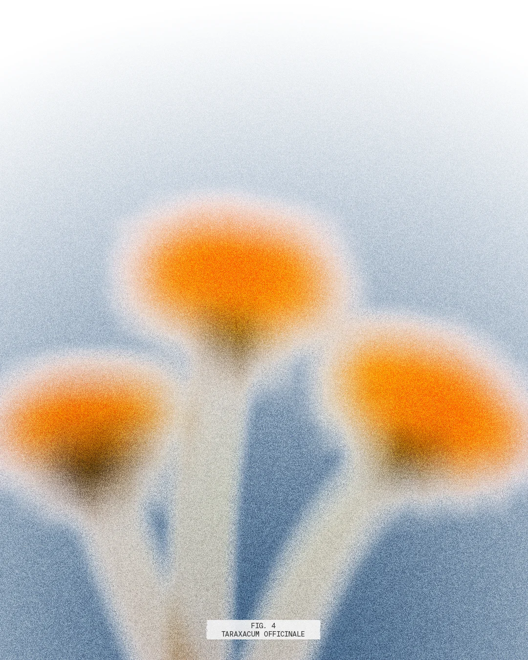
Flower Explorations
[Experimental]
03.2025
Personal project
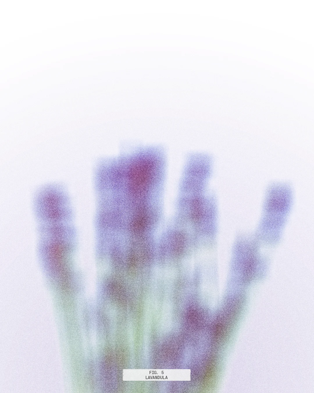
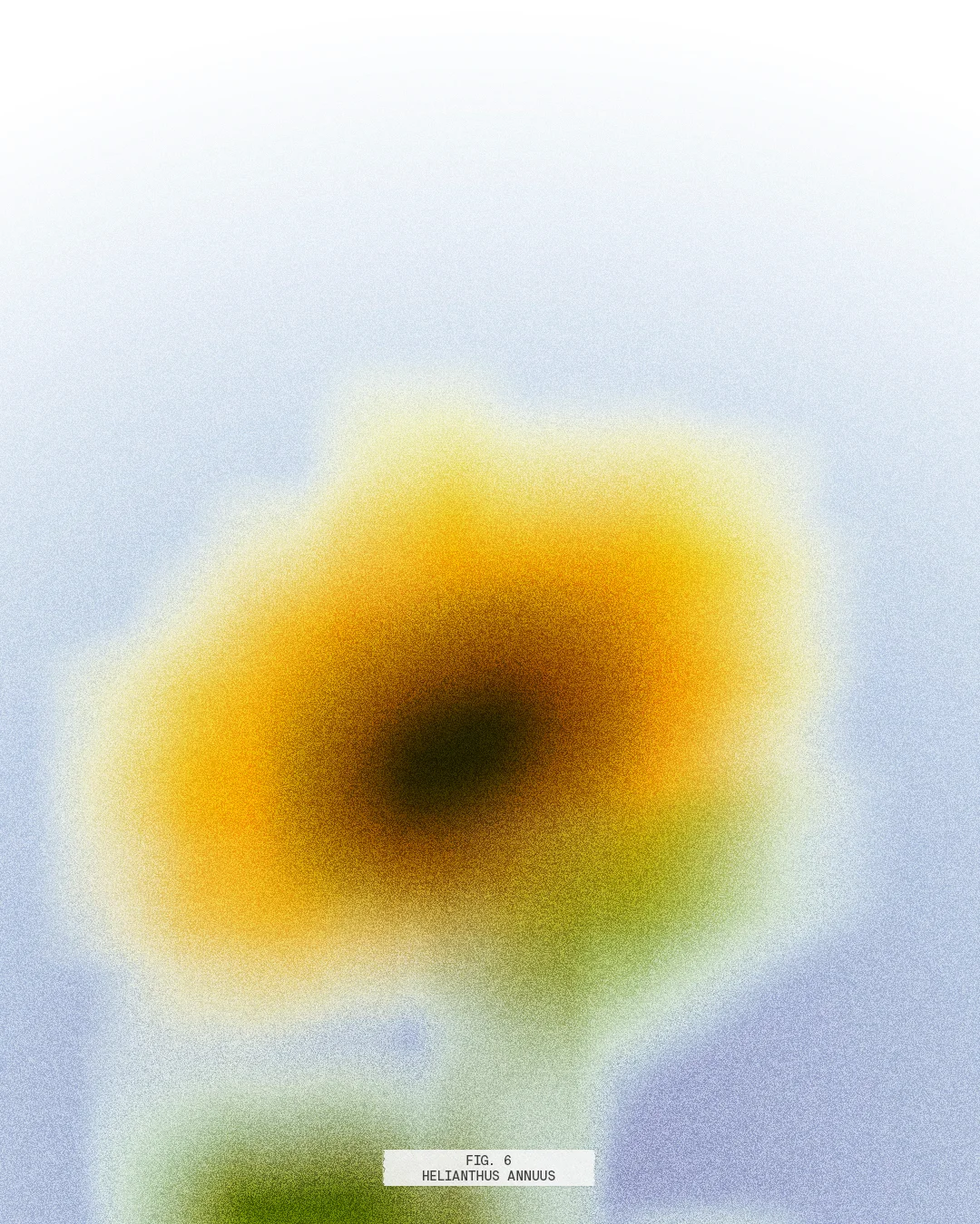
Experimental photography and editing project of some flowers I like.
(Fig. 1) Narcissus
(Fig. 2) Dianthus Caryophyllus
(Fig. 3) Iris Spuria
(Fig. 4) Taraxacum Officinale
(Fig. 5) Lavandula
(Fig. 6) Helianthus Annuus
P.004
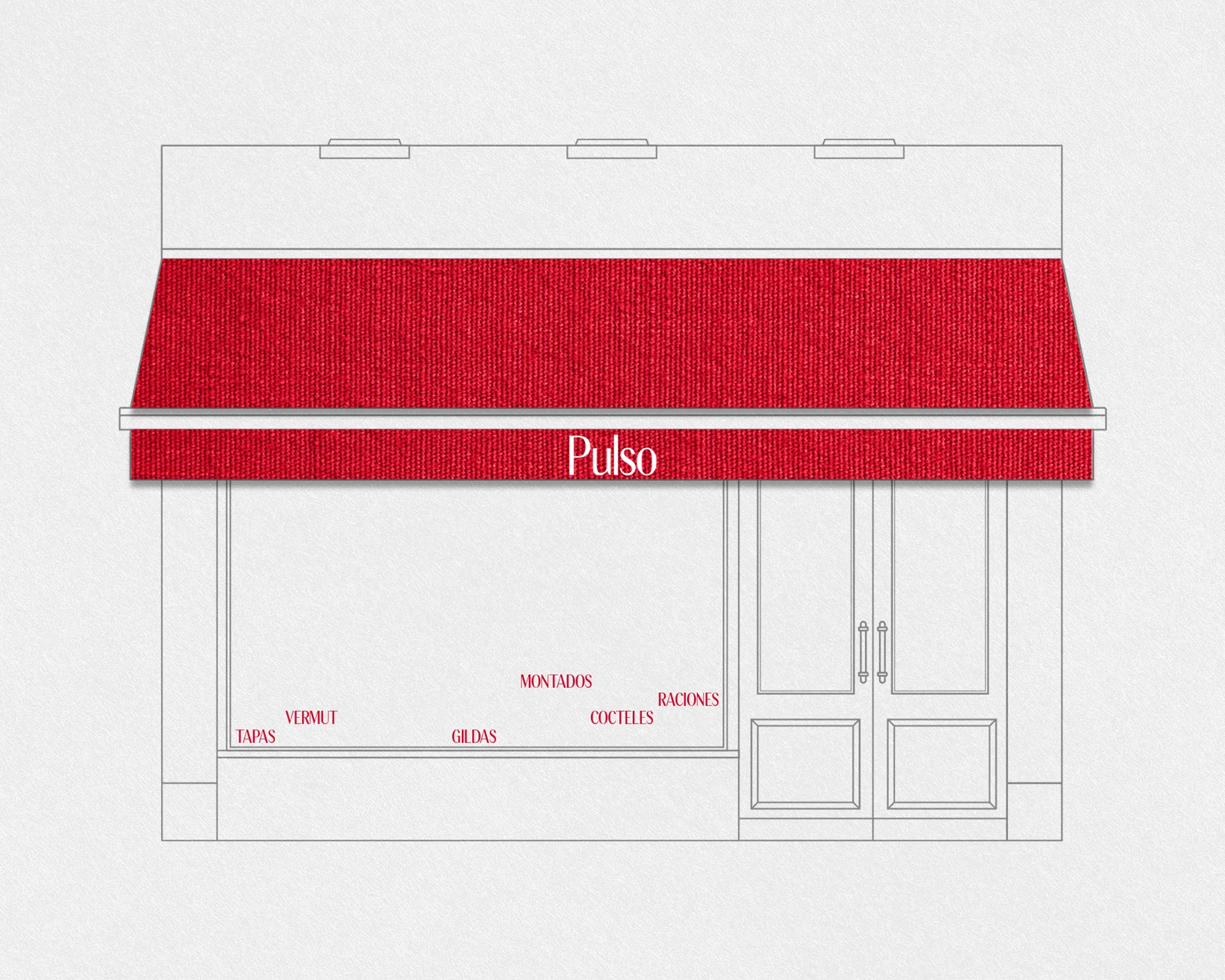
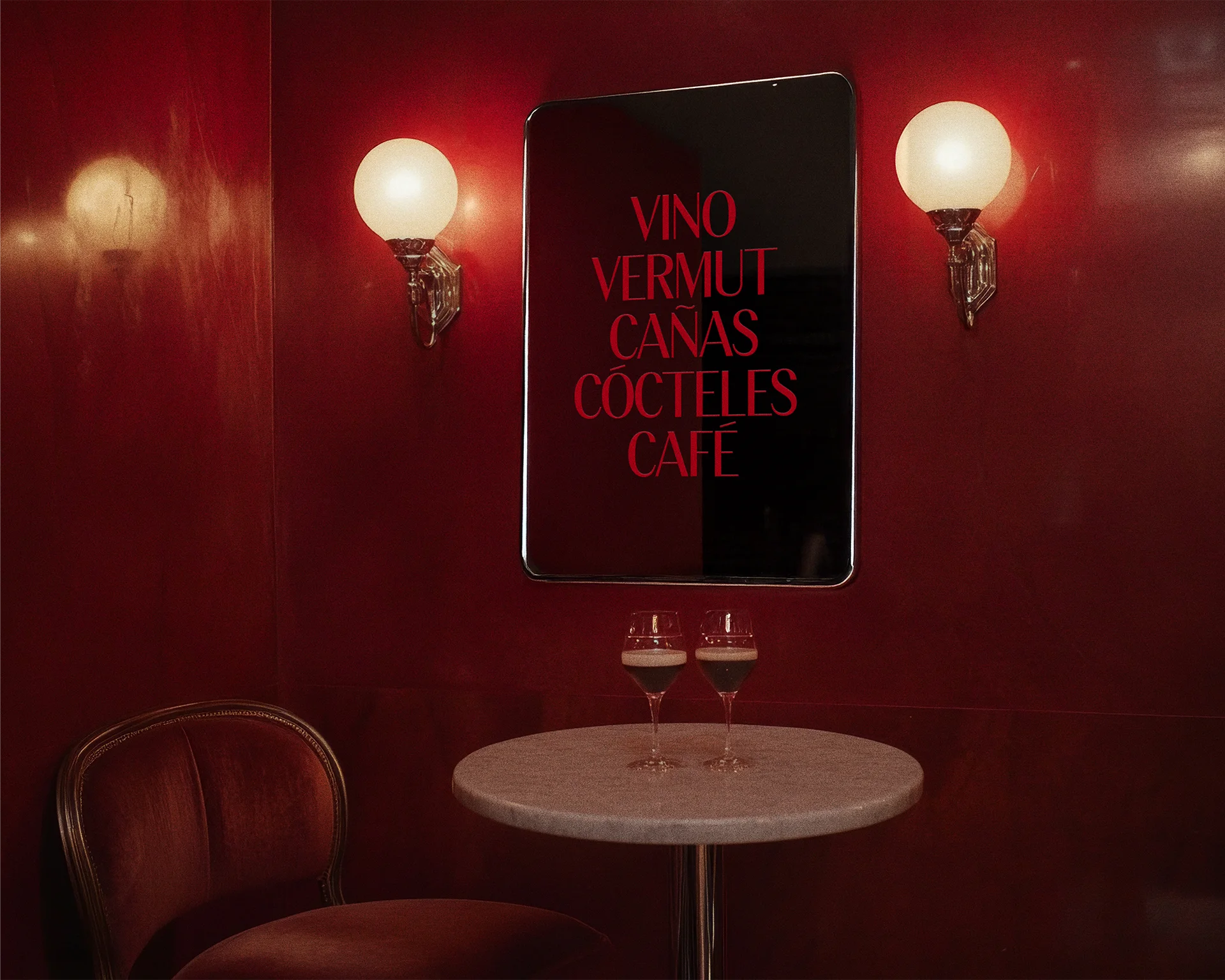
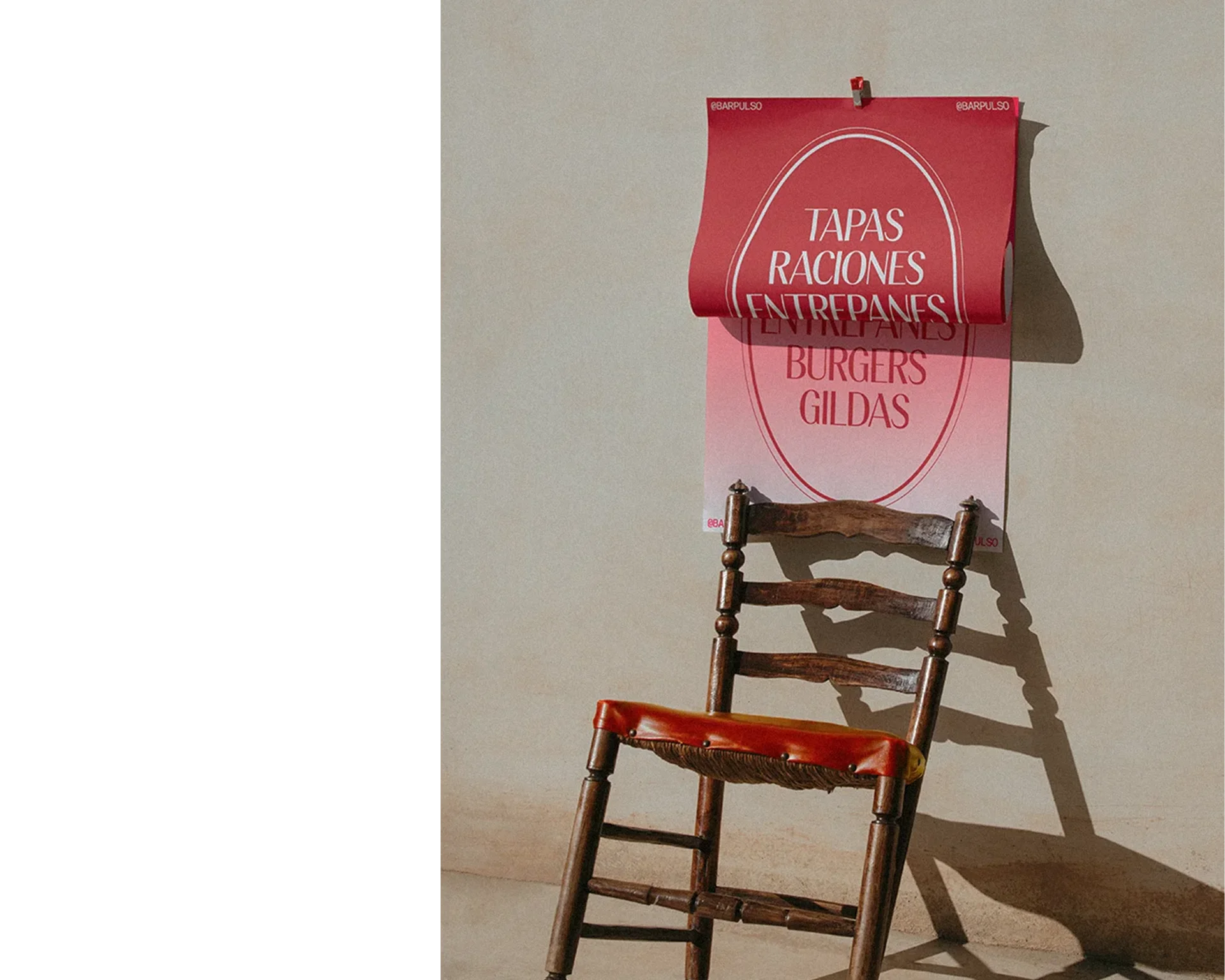
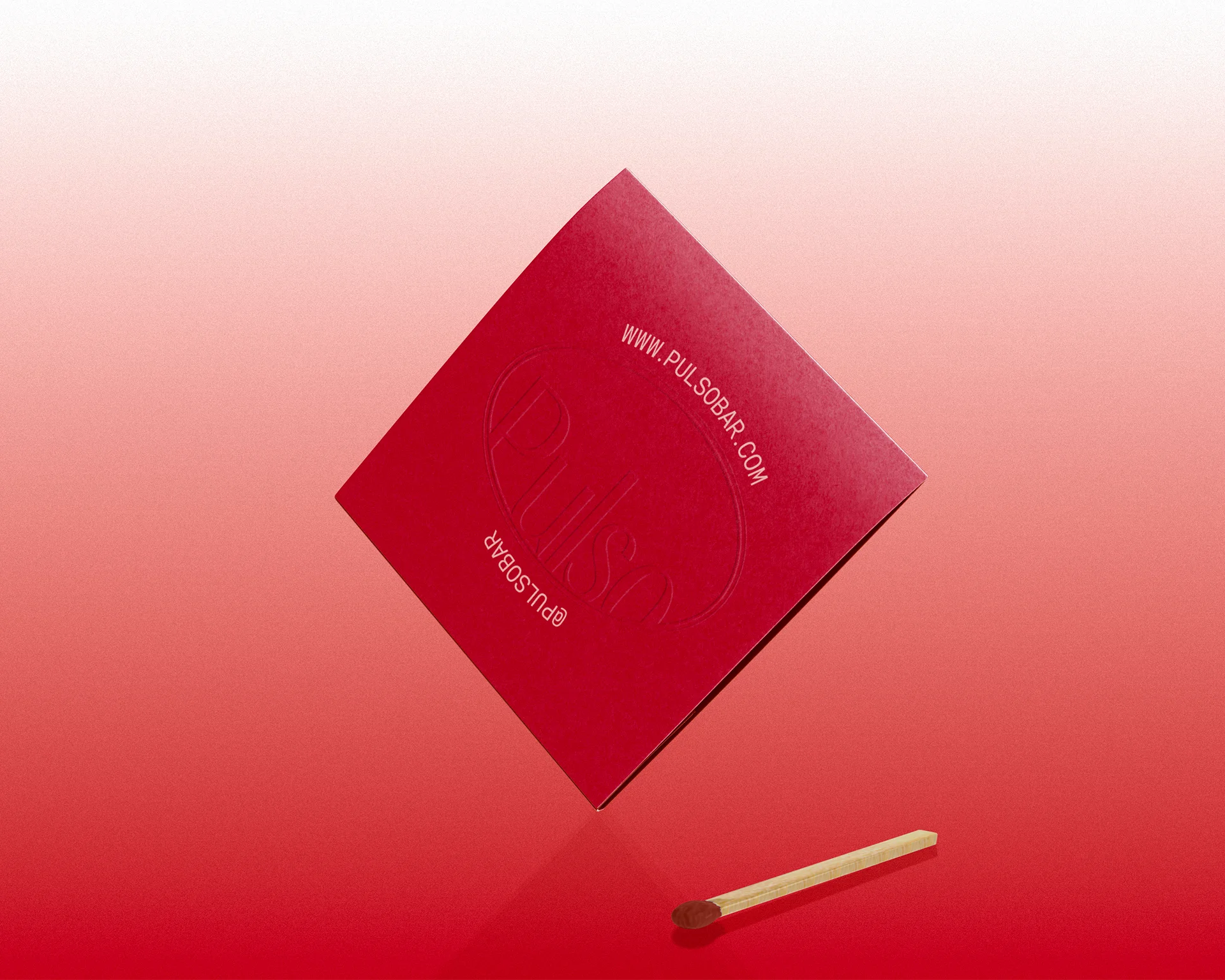
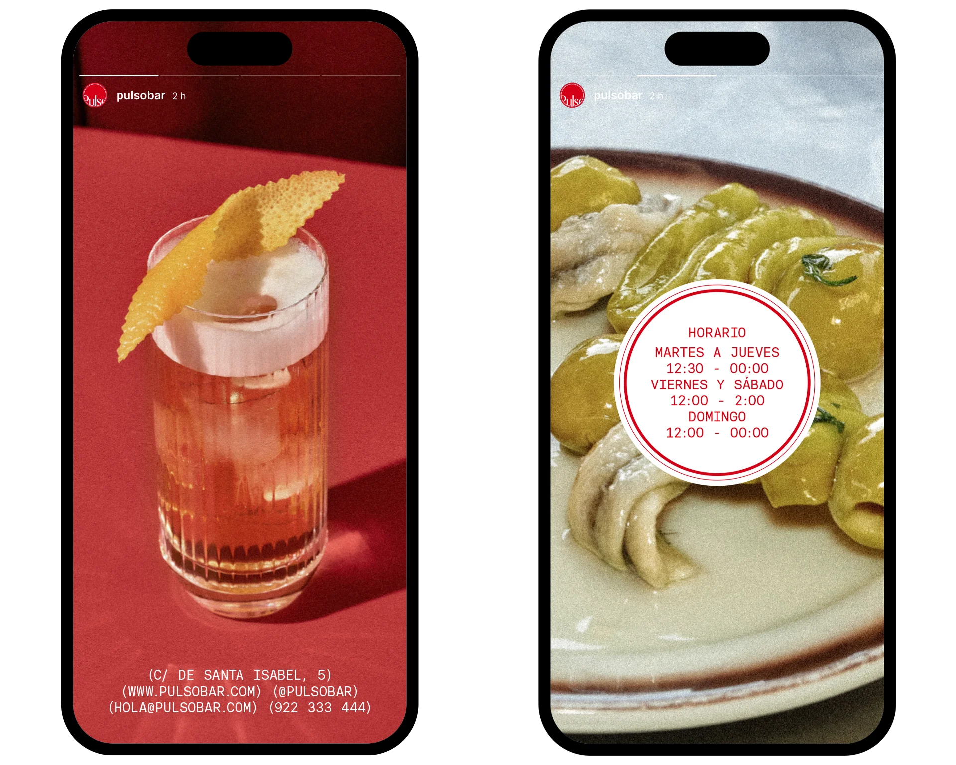
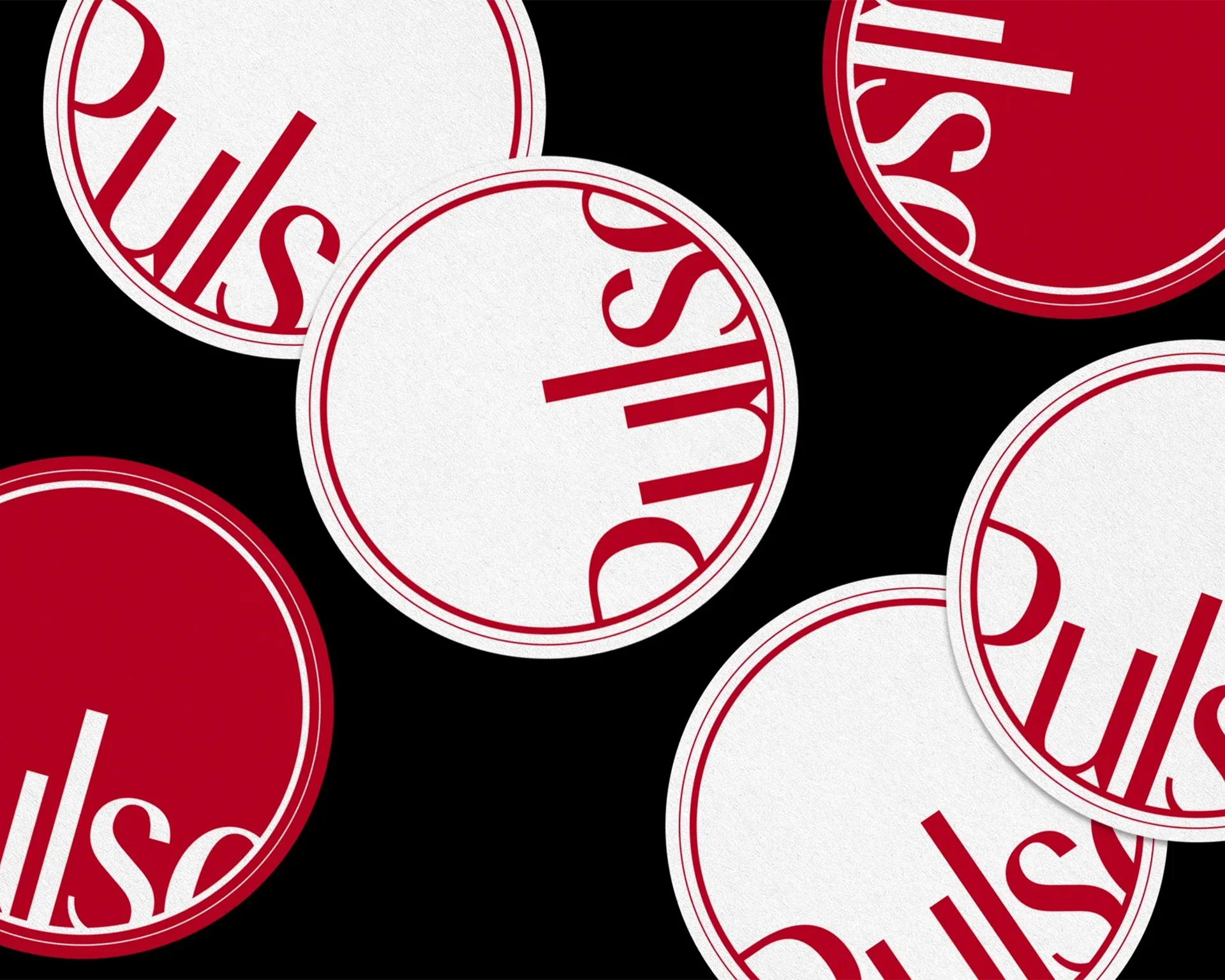
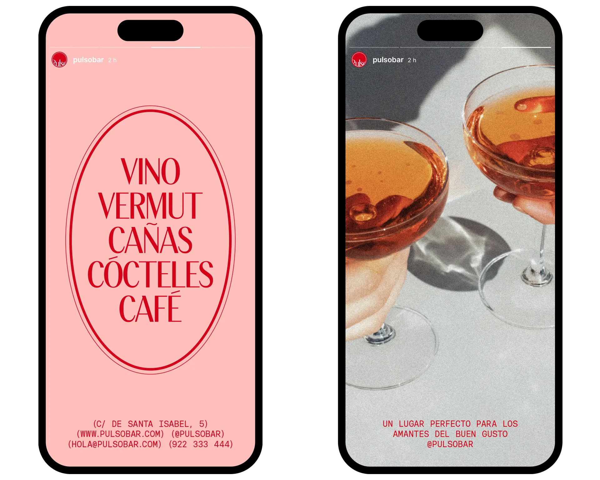
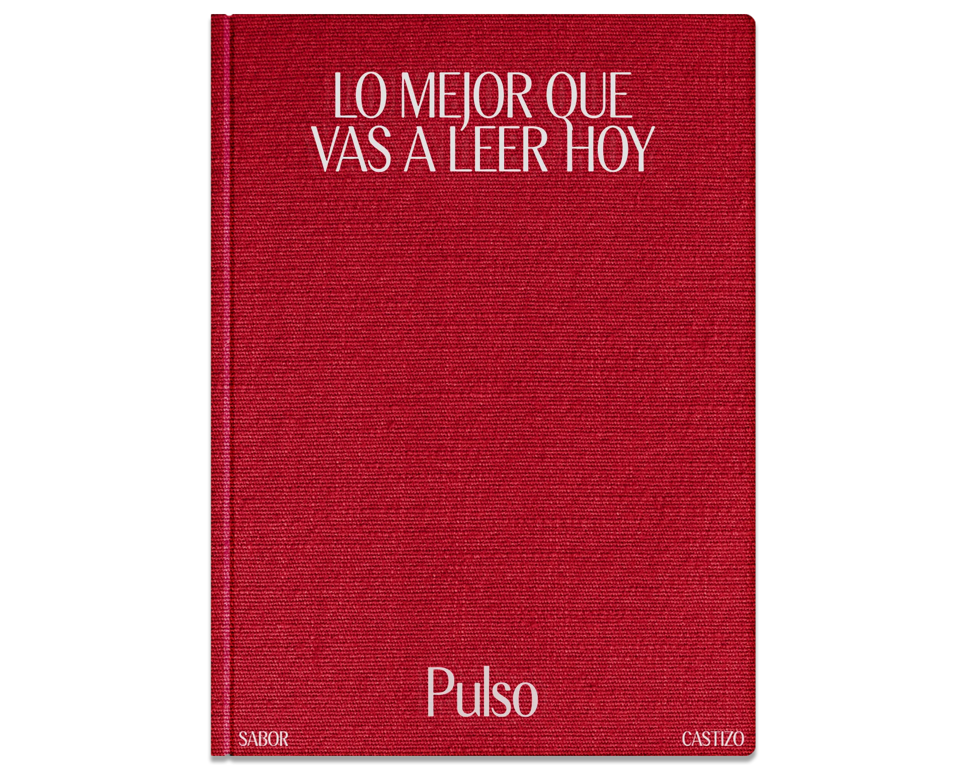
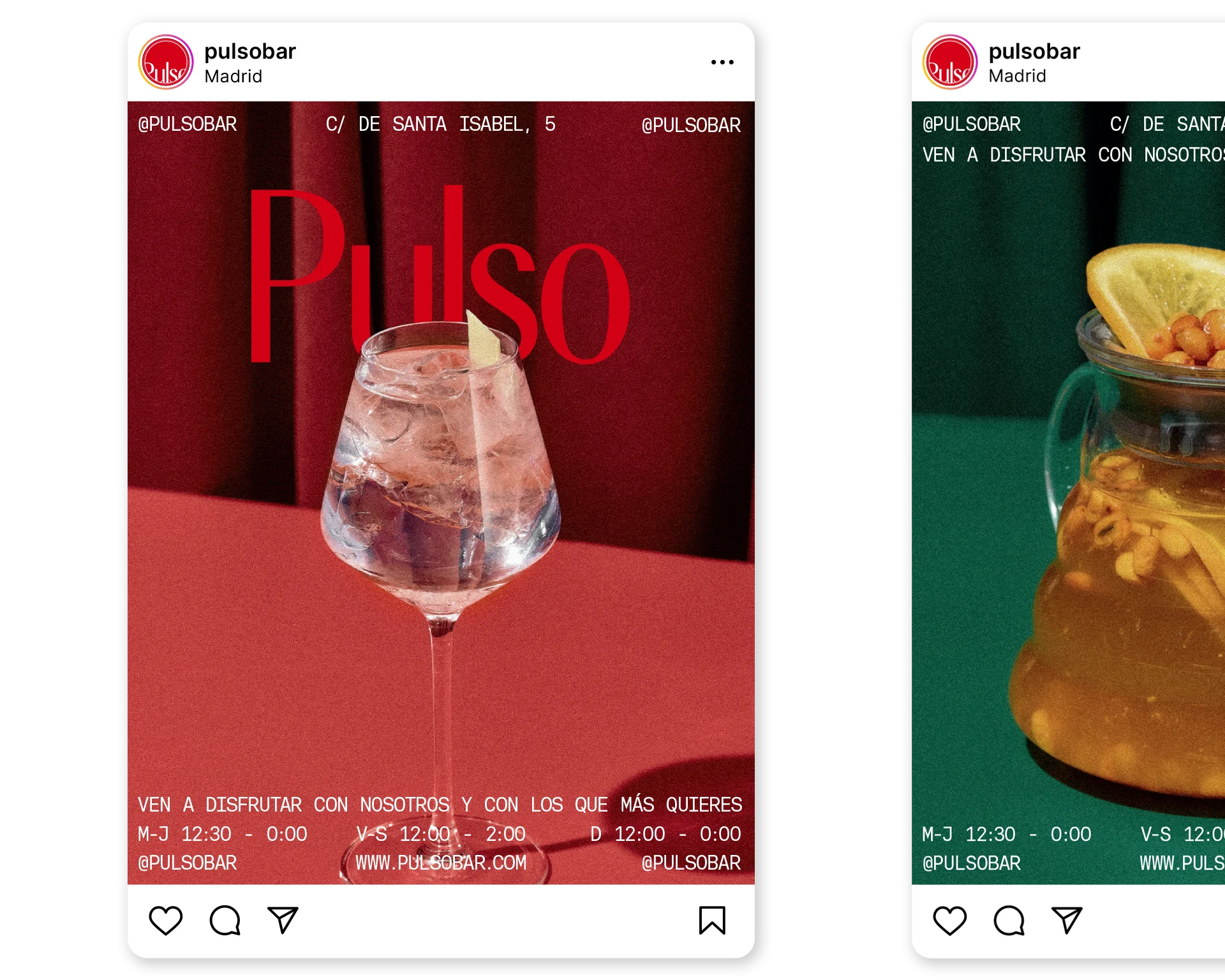
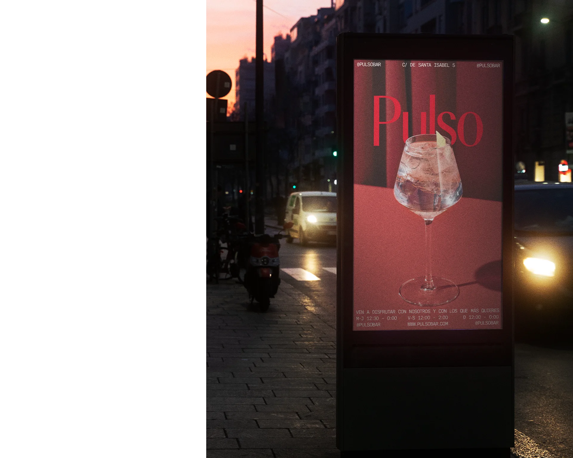
Bar Pulso
[Visual identity]
10.2024
Academic project
Pulso is a traditional Spanish food bar located in the city of Madrid. The identity has been renovated to give it a more modern and sophisticated approach capable of attracting a wider public, while maintaining the nostalgic character of Madrid’s traditional bars.
P.005
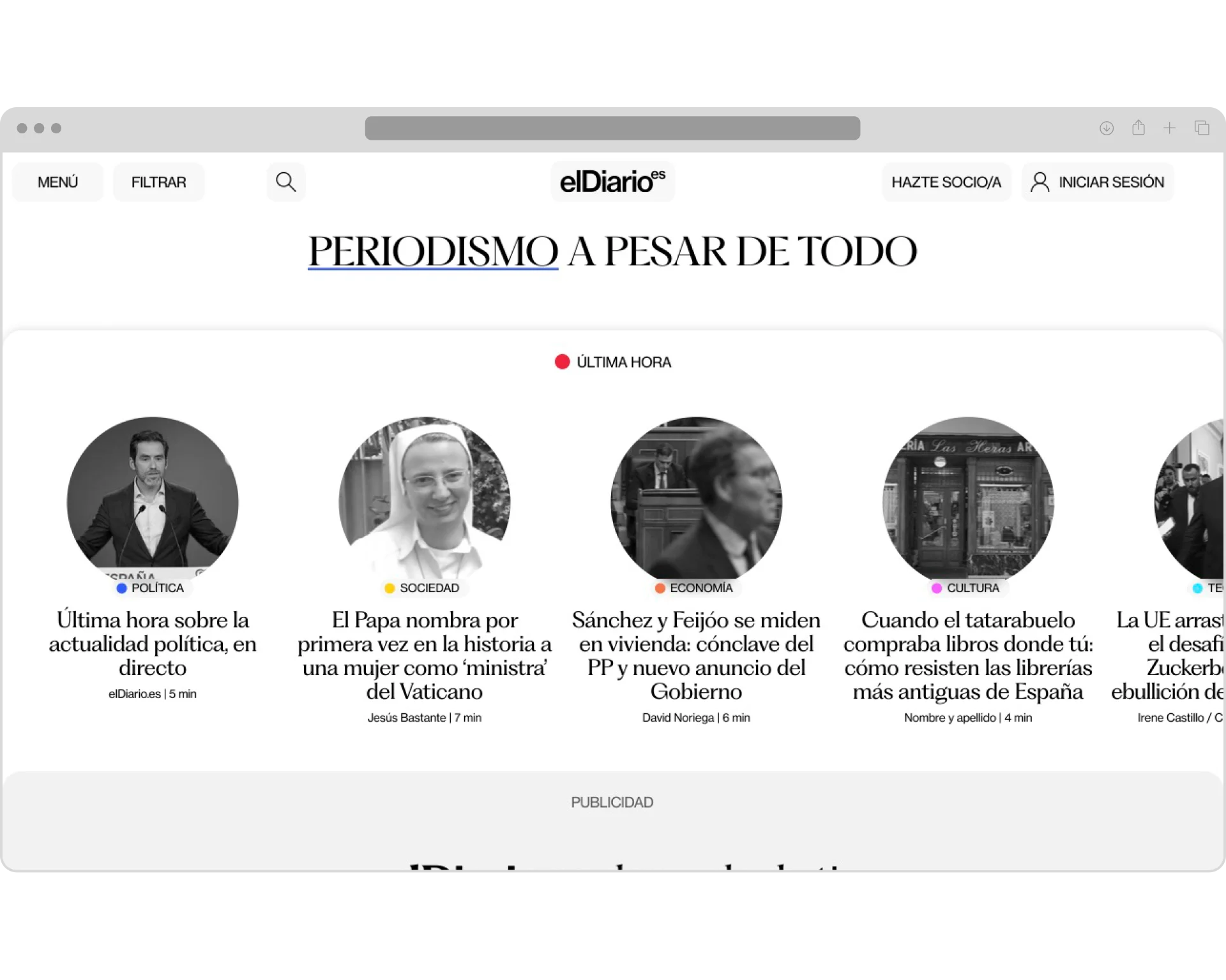
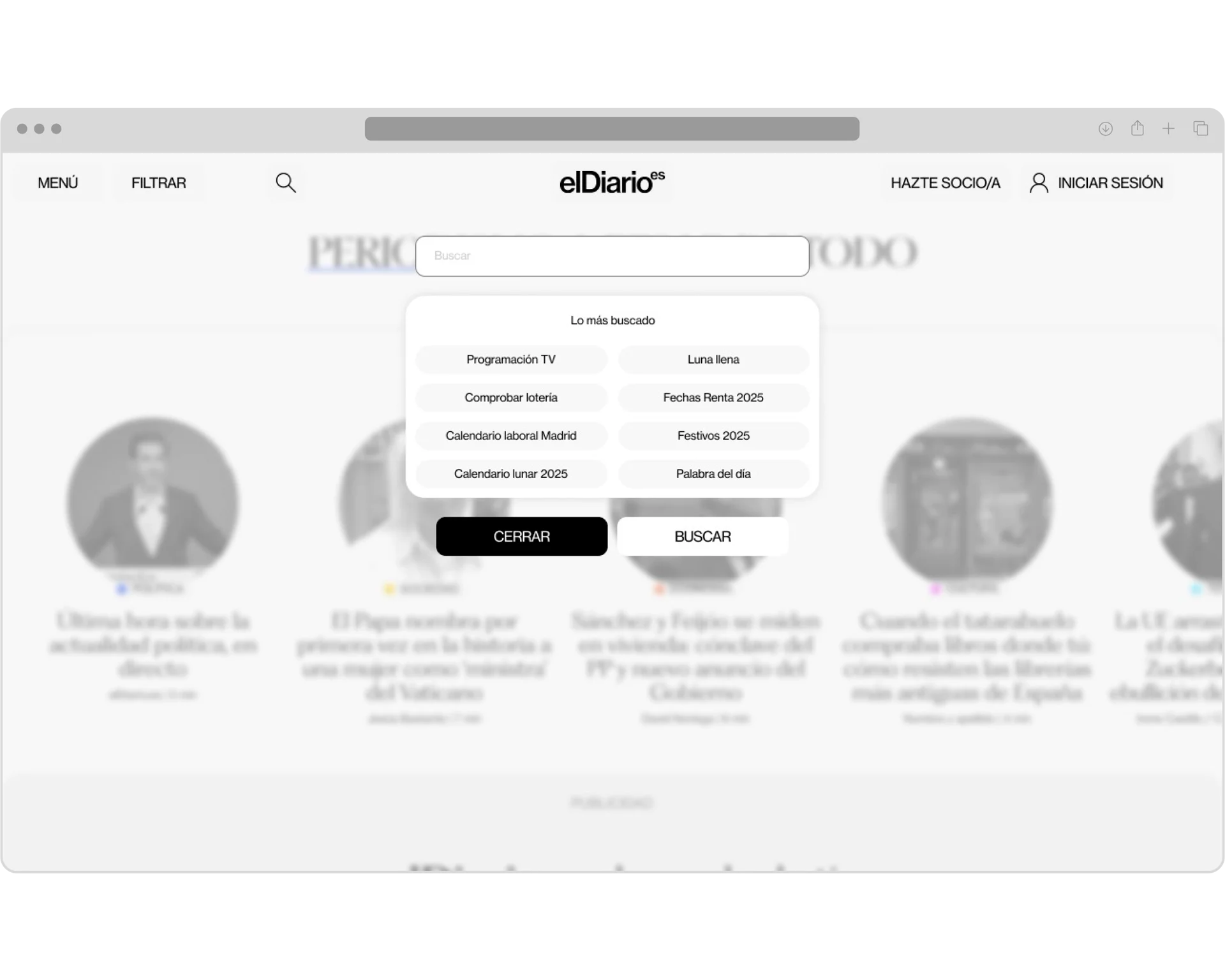
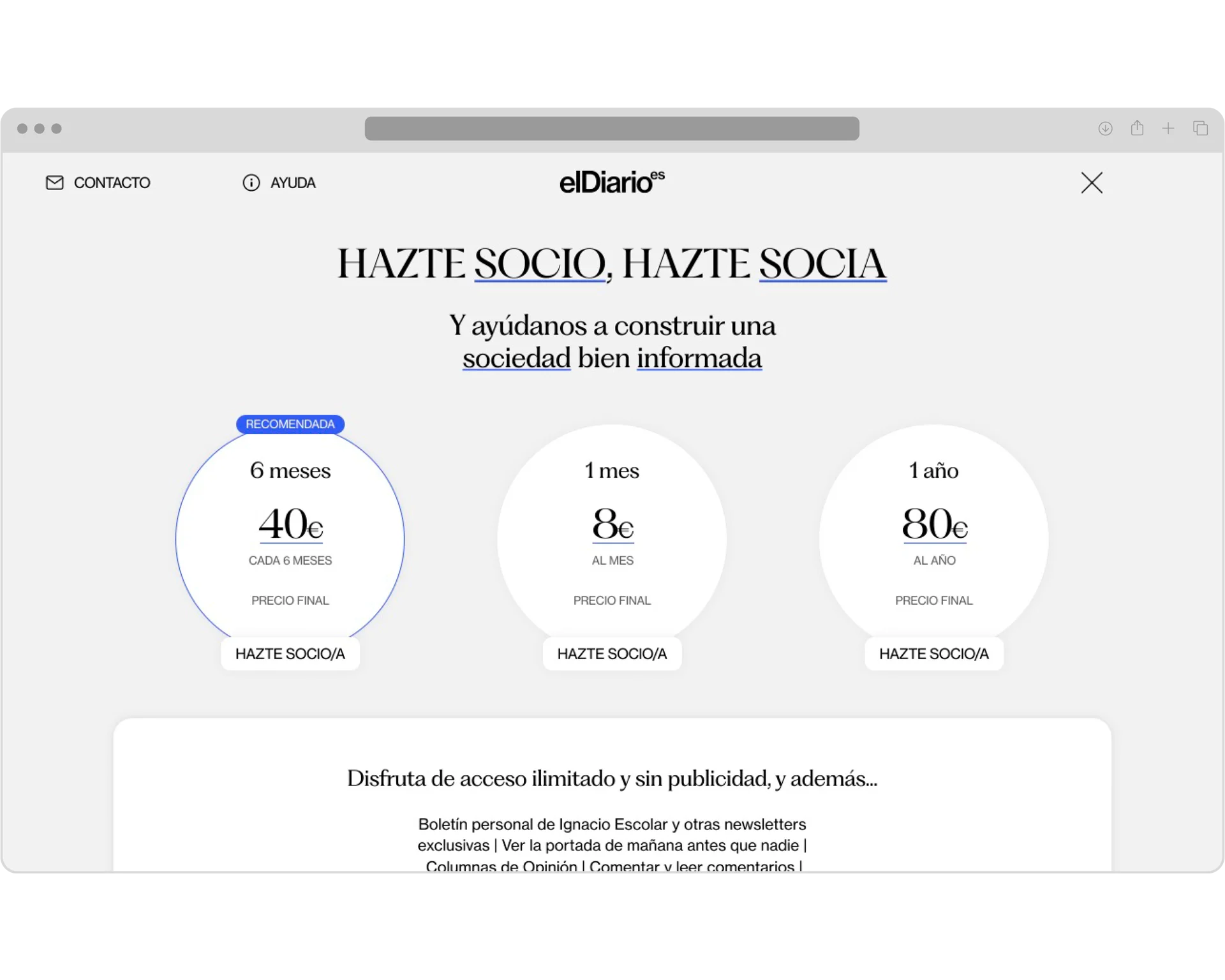
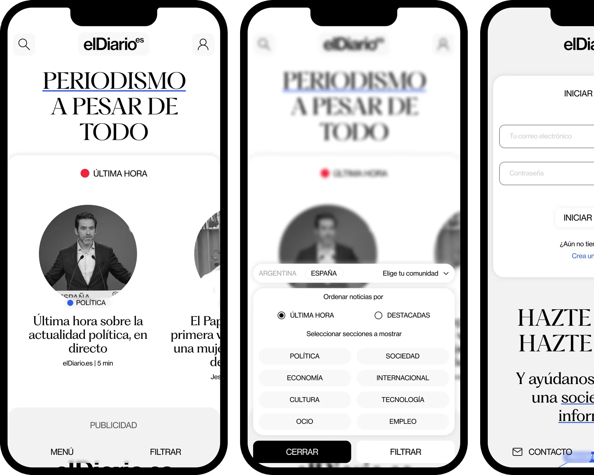
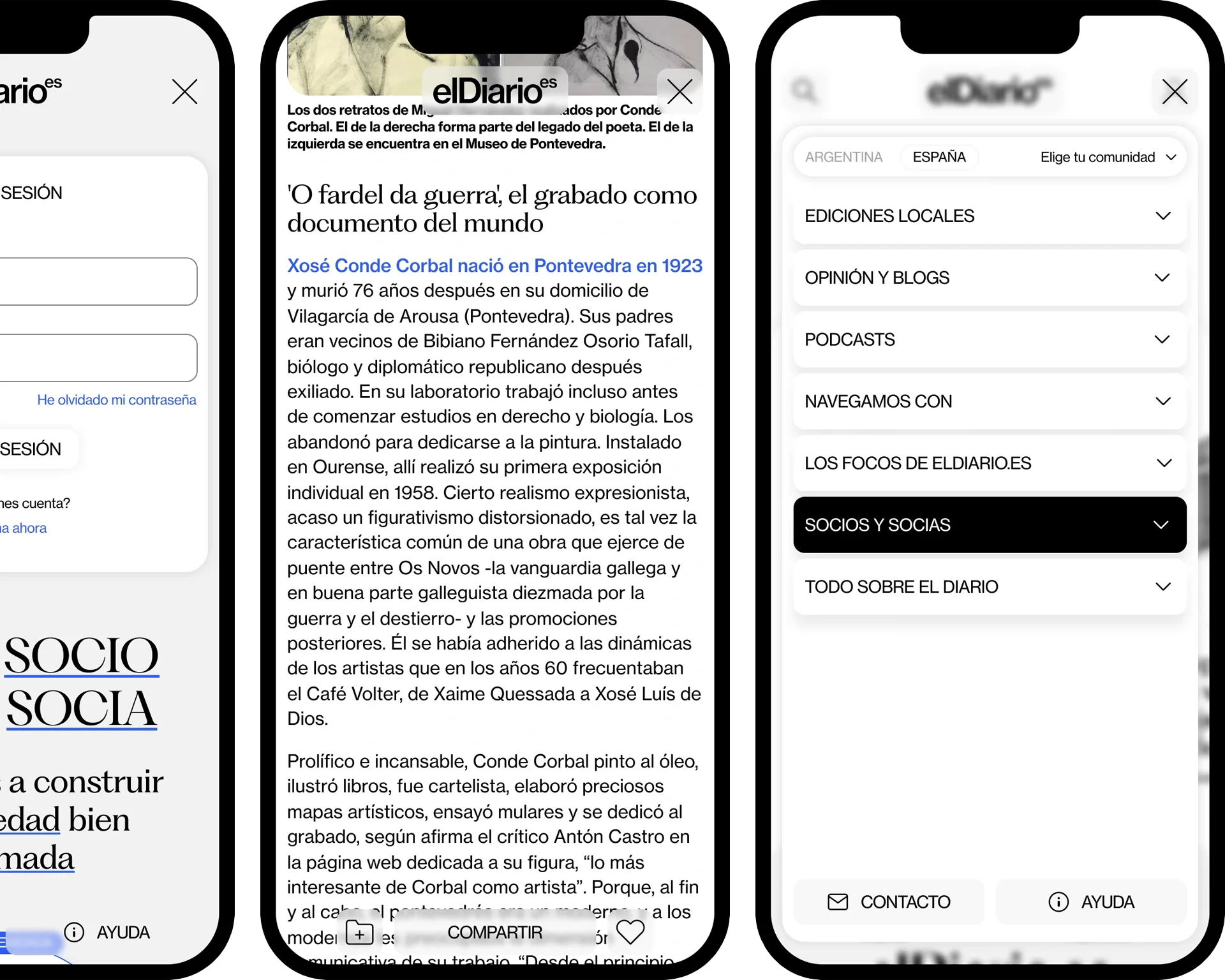
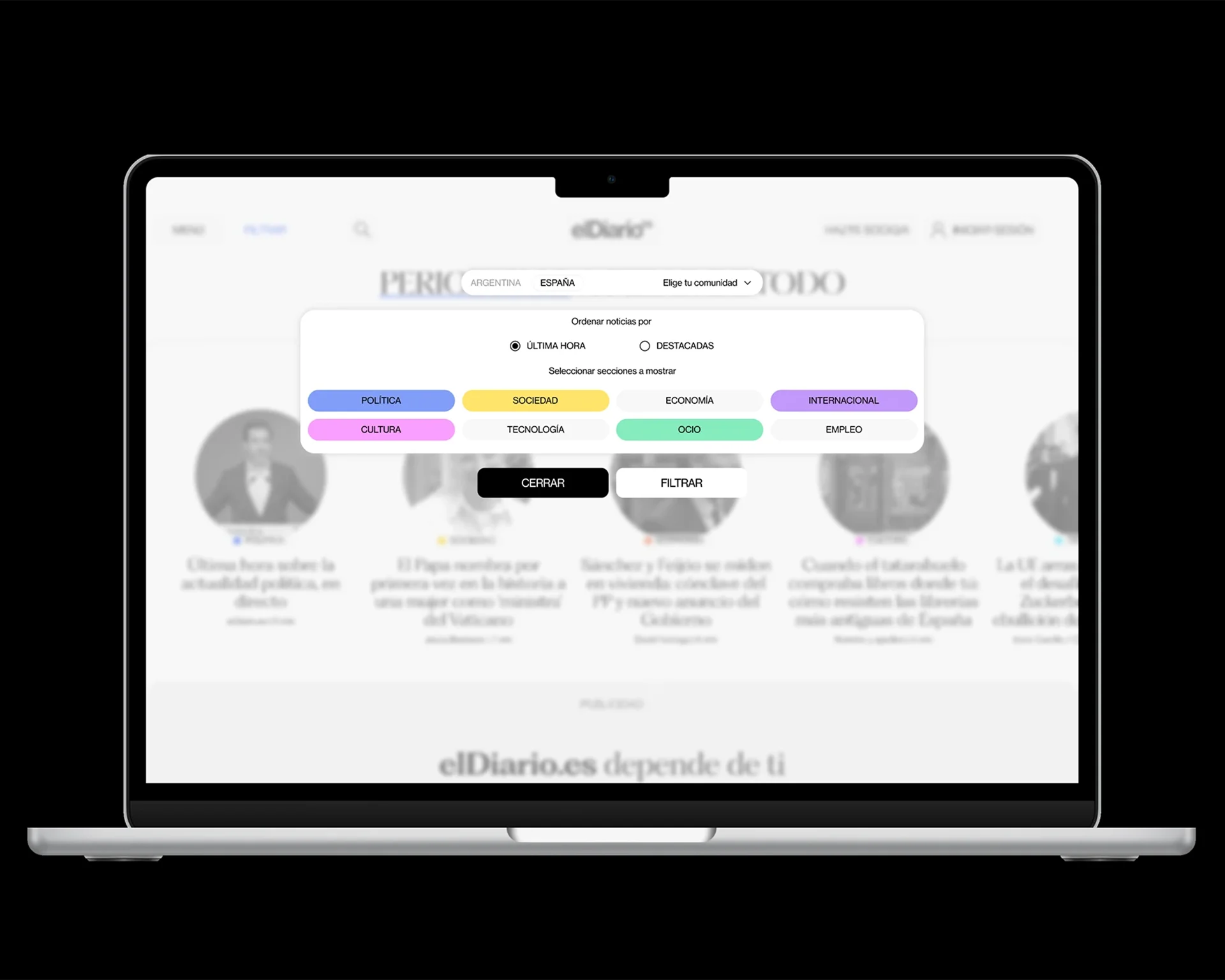
elDiario.es webpage
[Web design]
01.2025
Academic project
Redesign concept for eldiario.es website. An academic project for the Interface Design course, the aim was to create a simple, intuitive, and user-friendly interface while standing out from other media web designs.
P.006
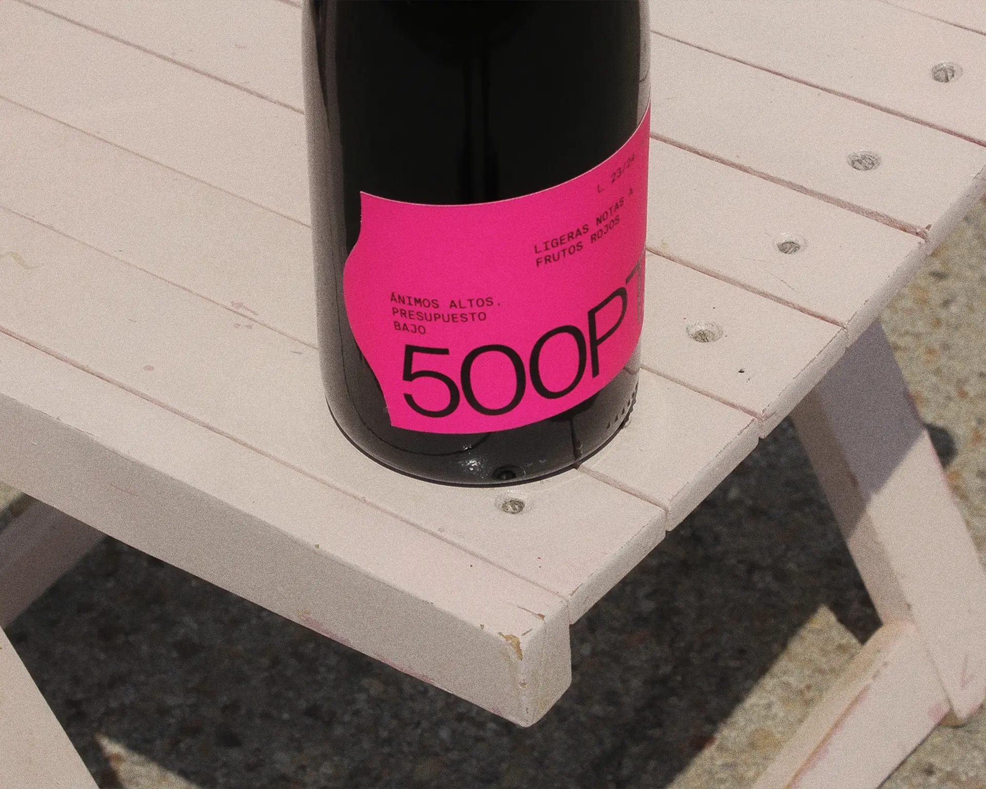
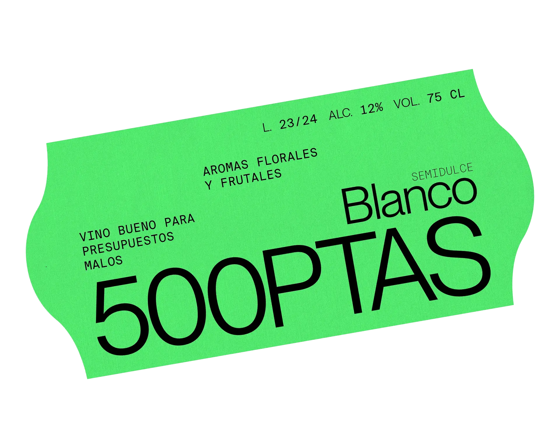
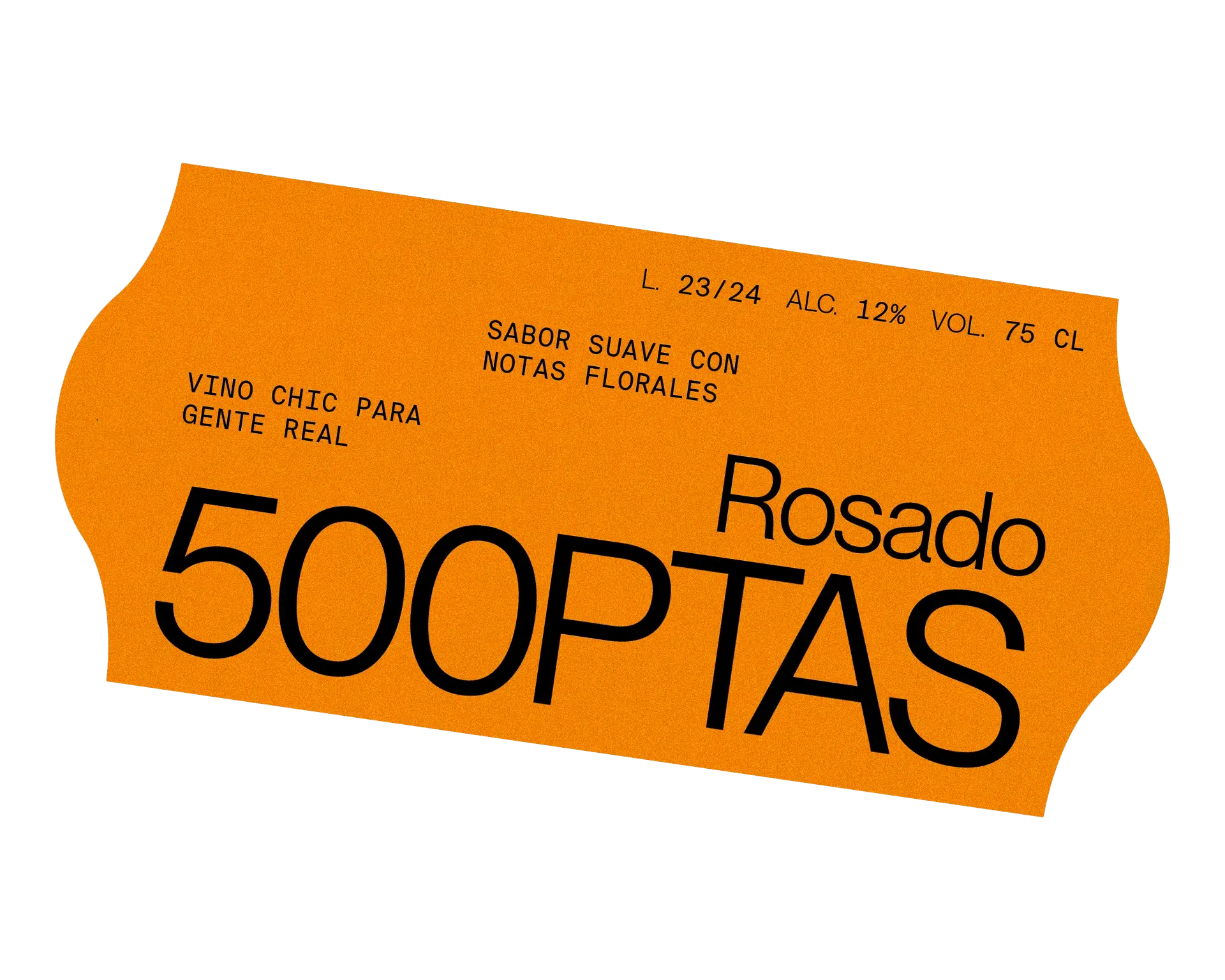
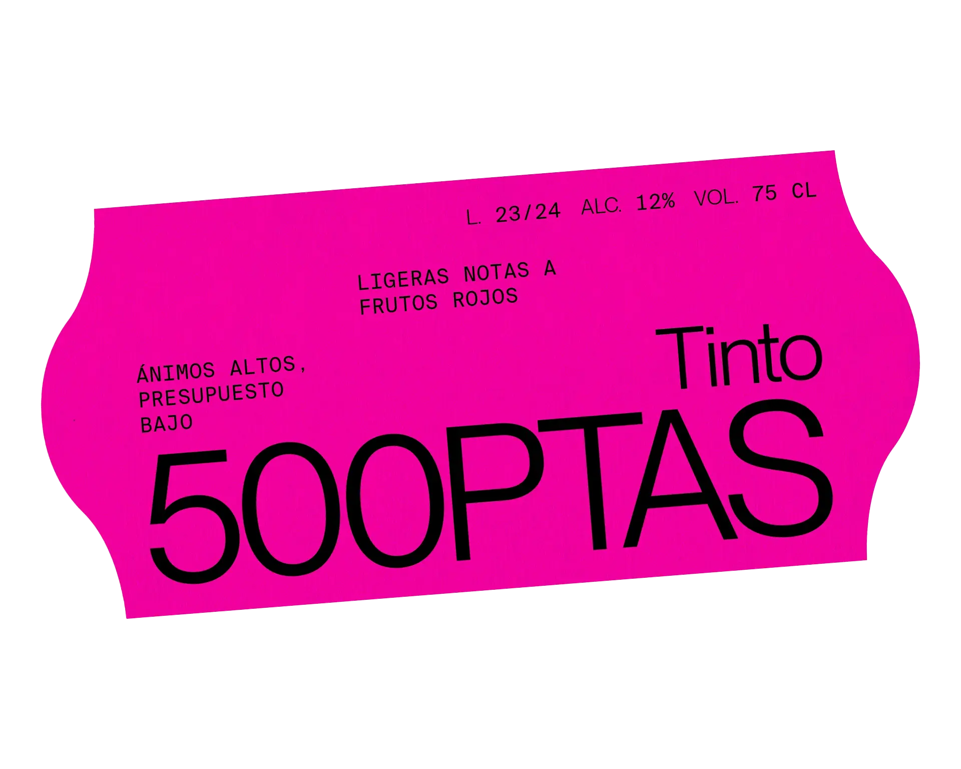
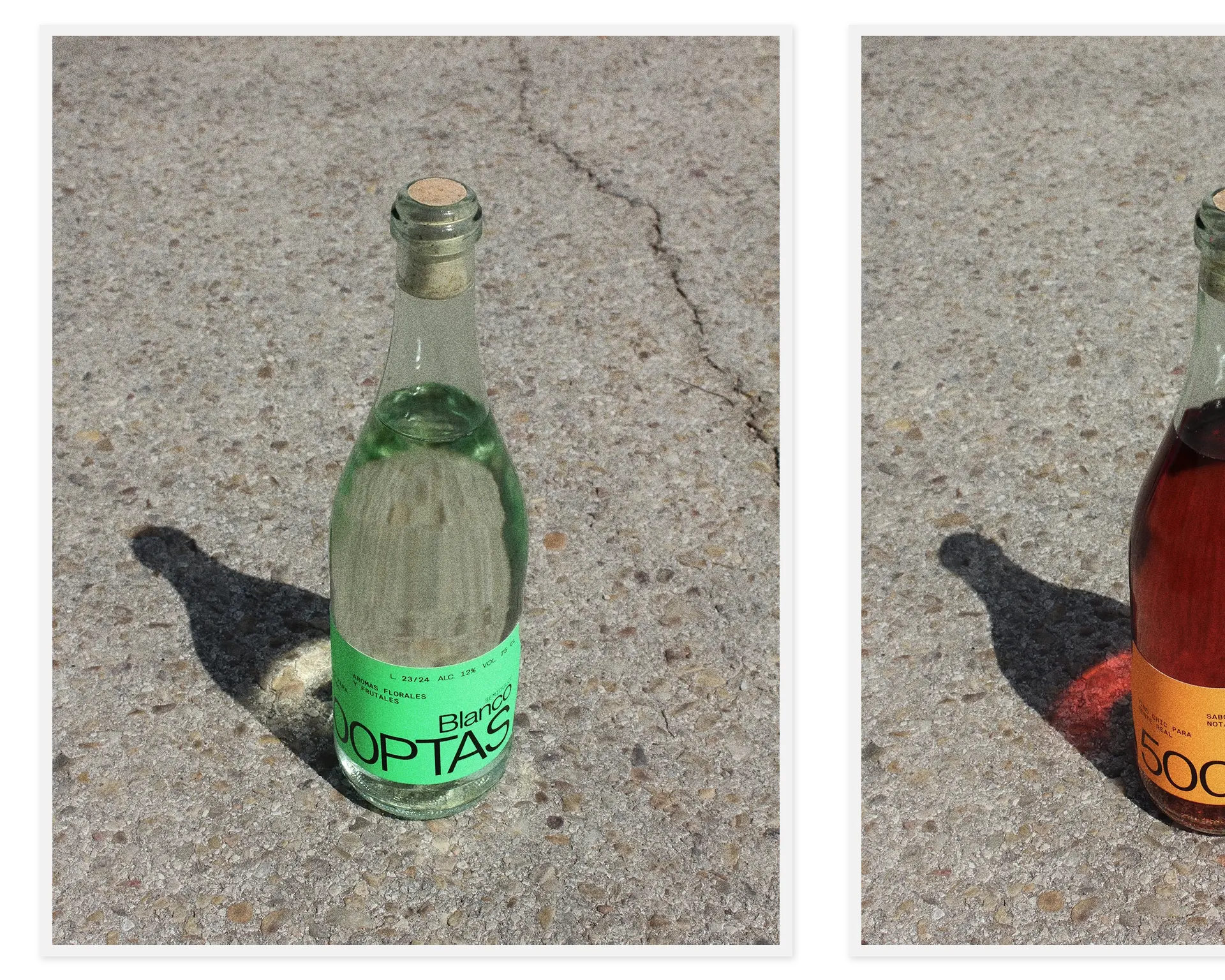
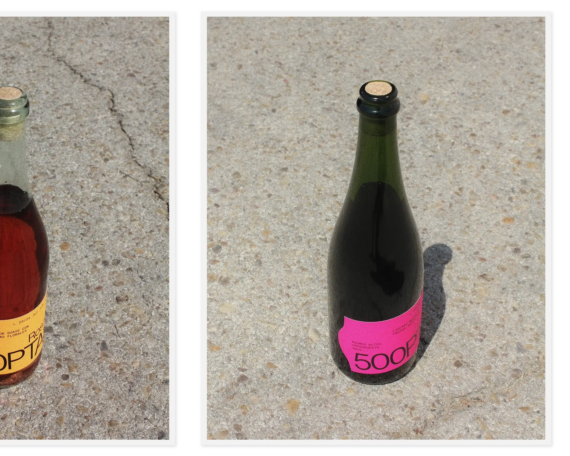
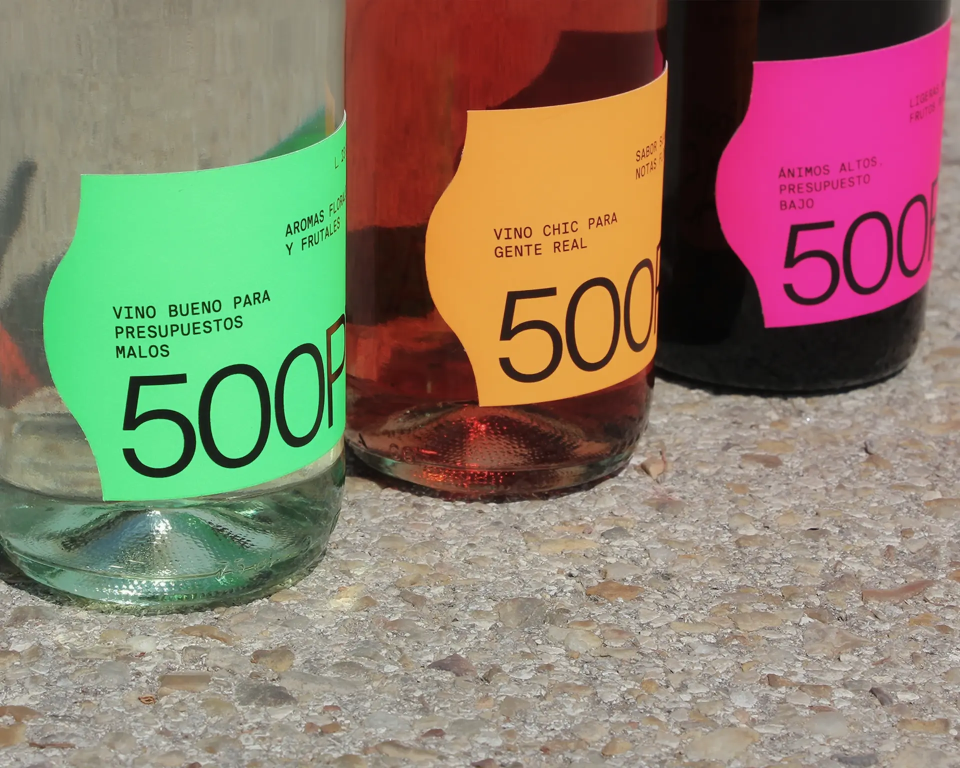
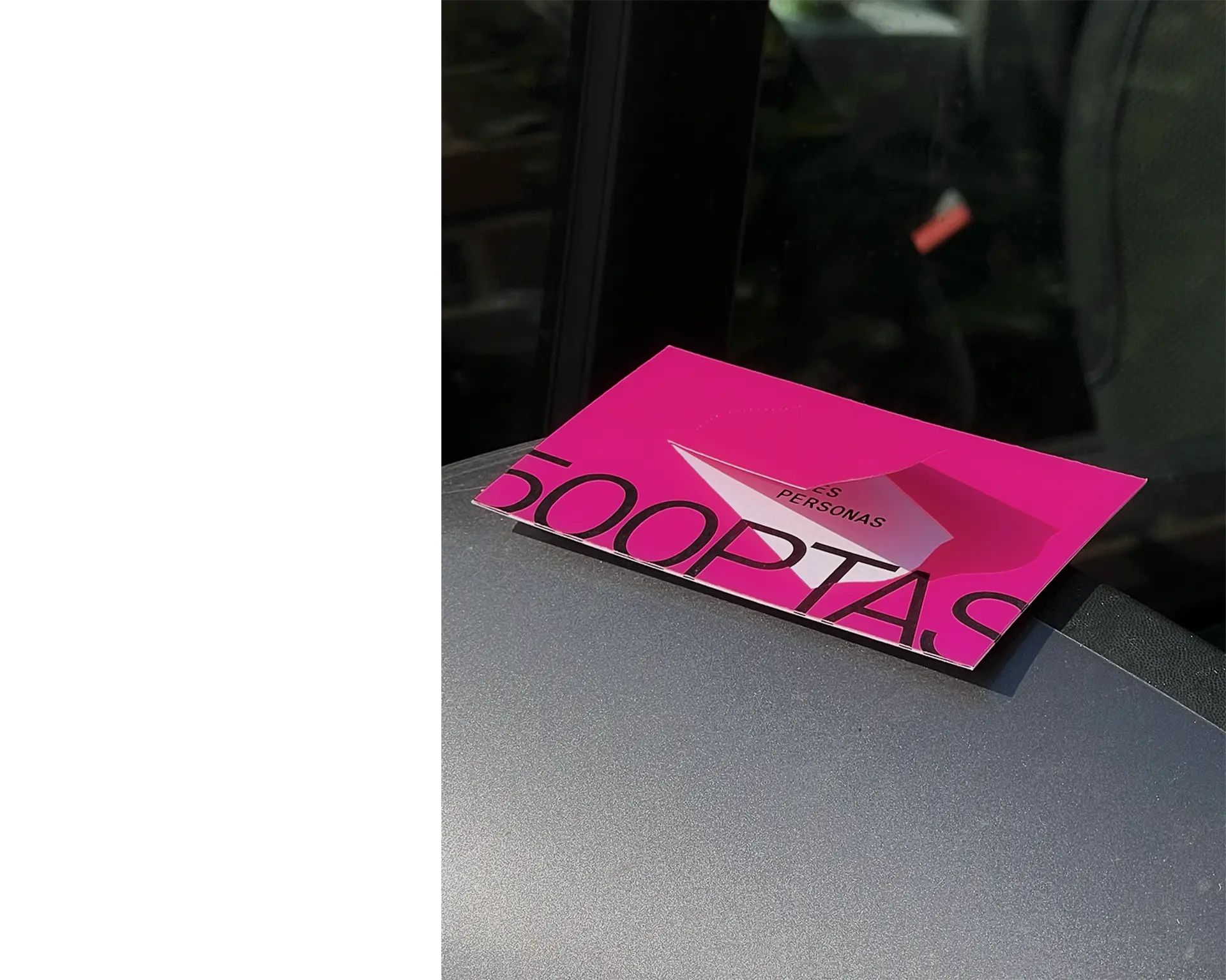
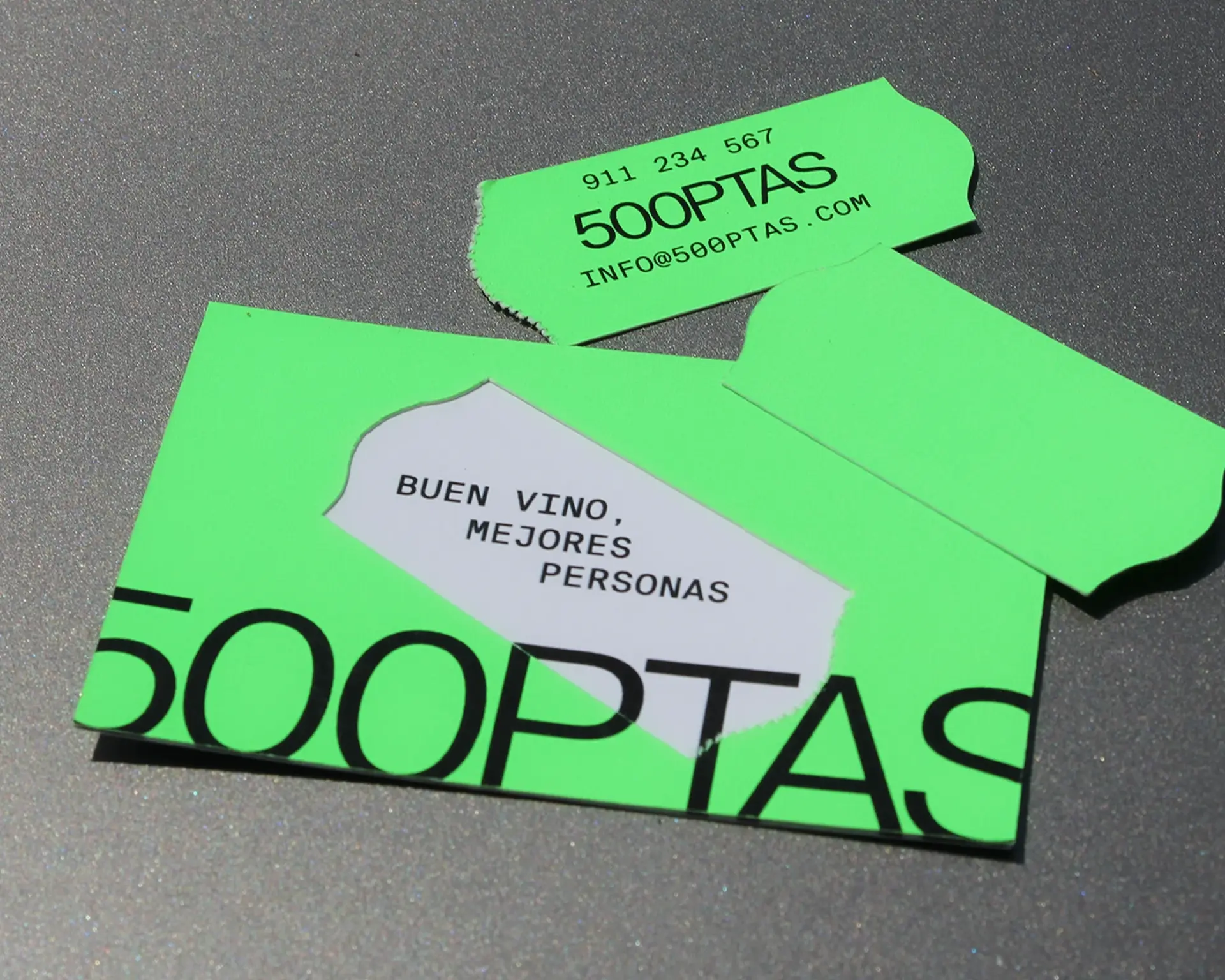
500PTAS
[Visual identity & packaging]
07.2024
Personal project
500PTAS wine label is a nod to the classic orange price tags of small local stores. The label pays homage to tradition, underscoring the brand’s commitment to offering a well-crafted product while remaining affordable and accessible to all budgets, as the name 500 ptas suggests.
P.007
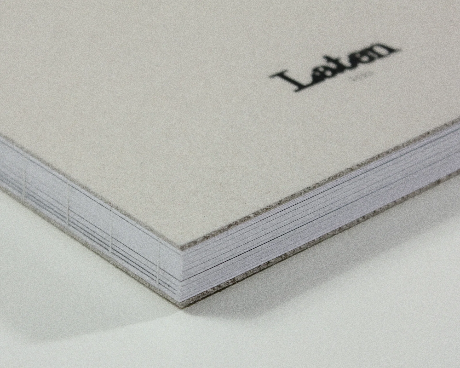
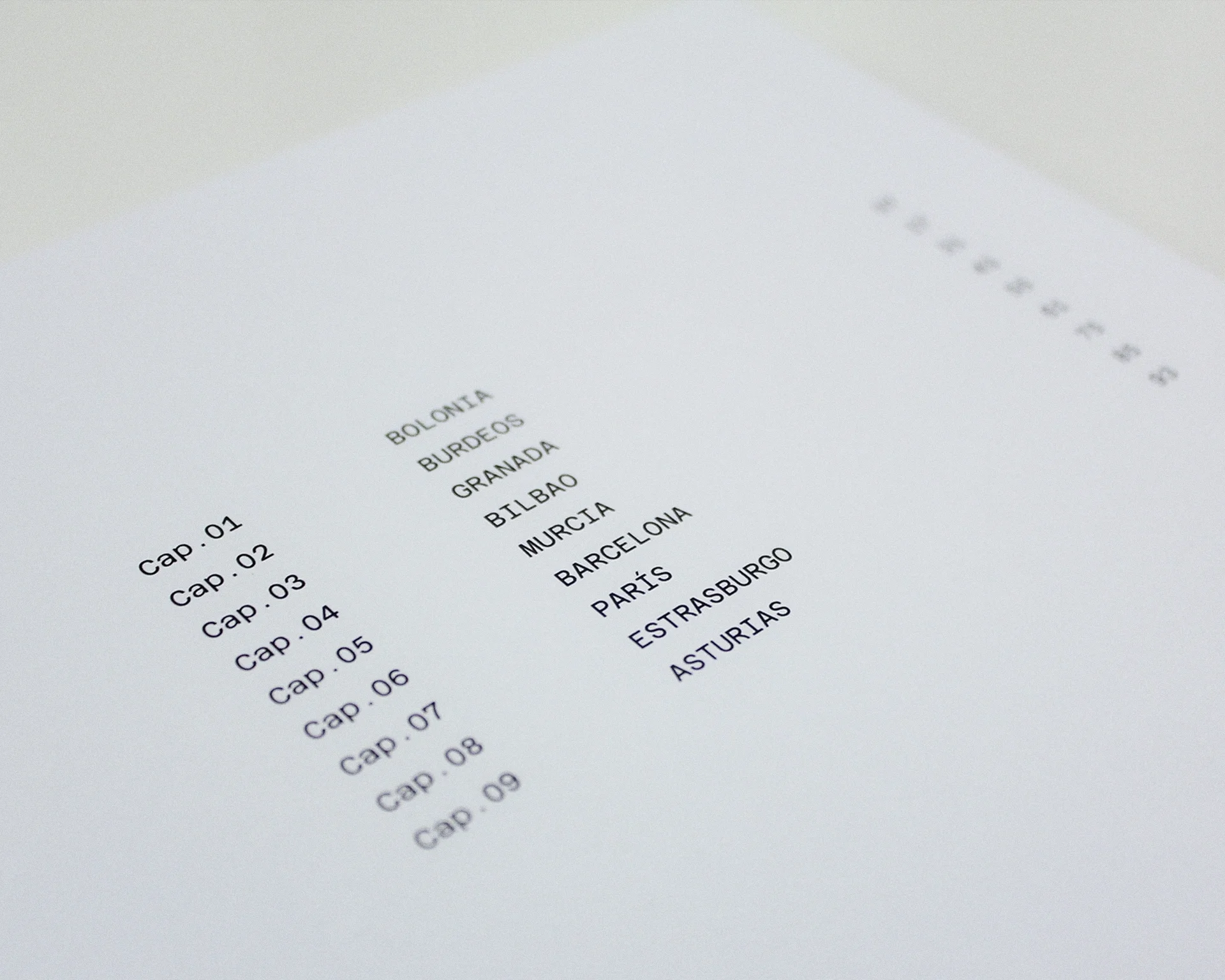
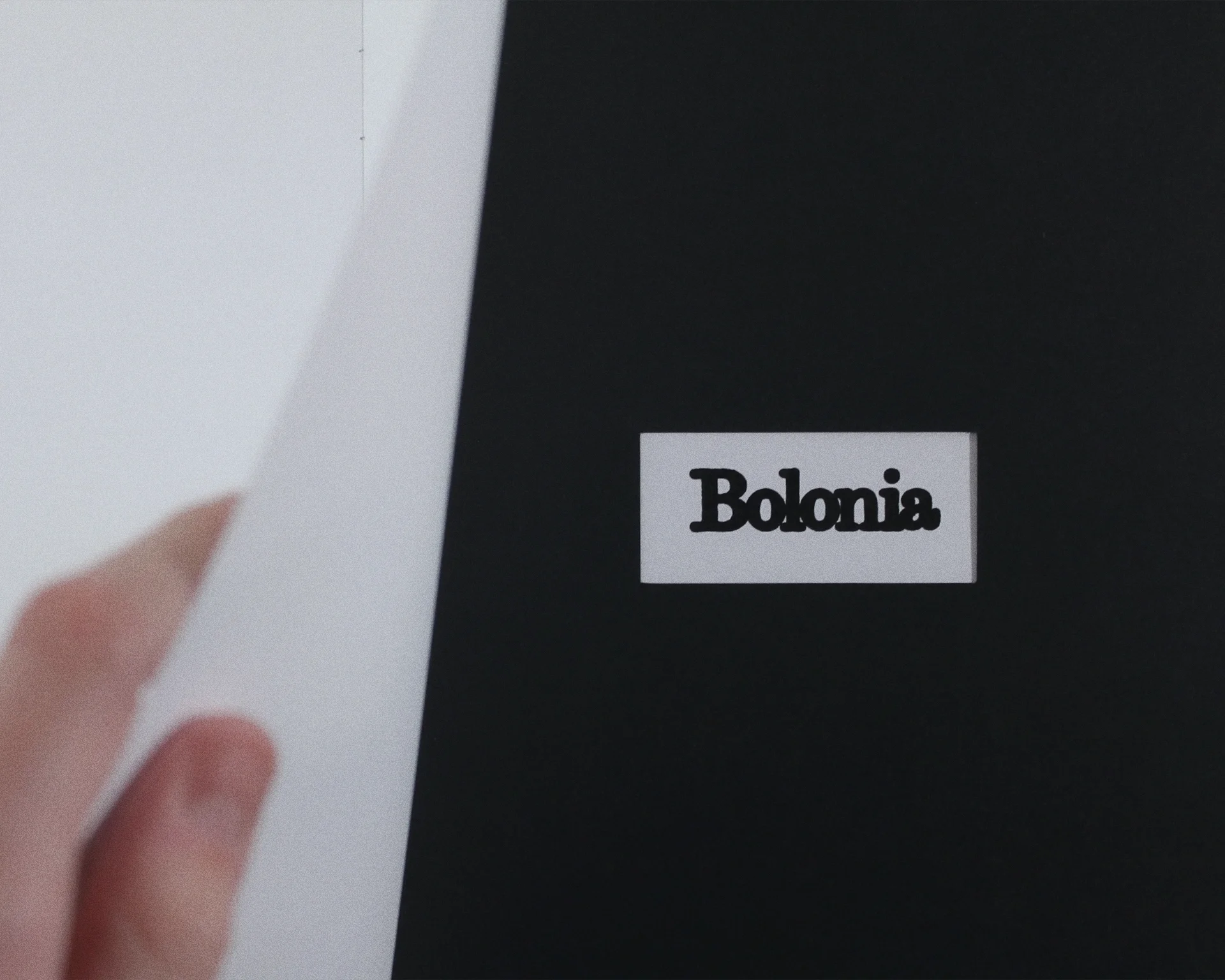
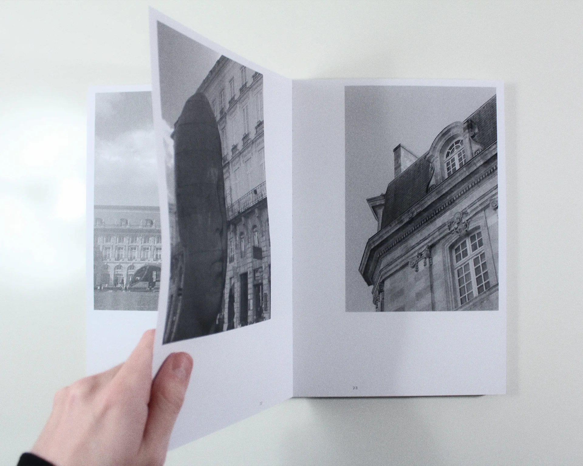
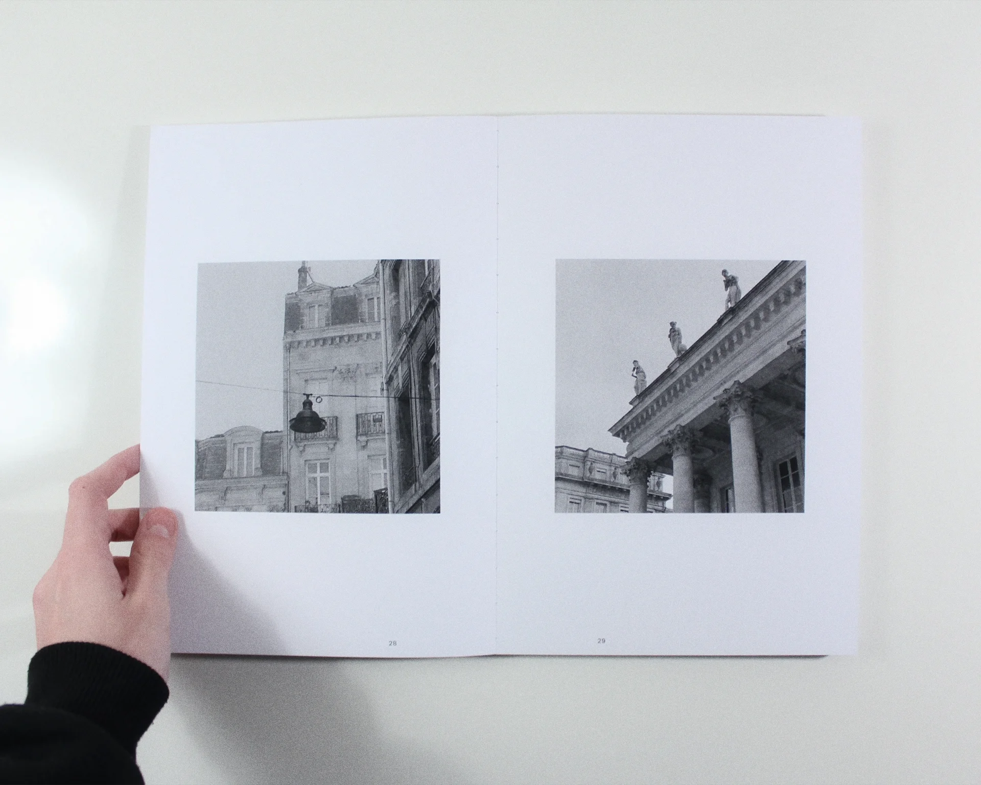
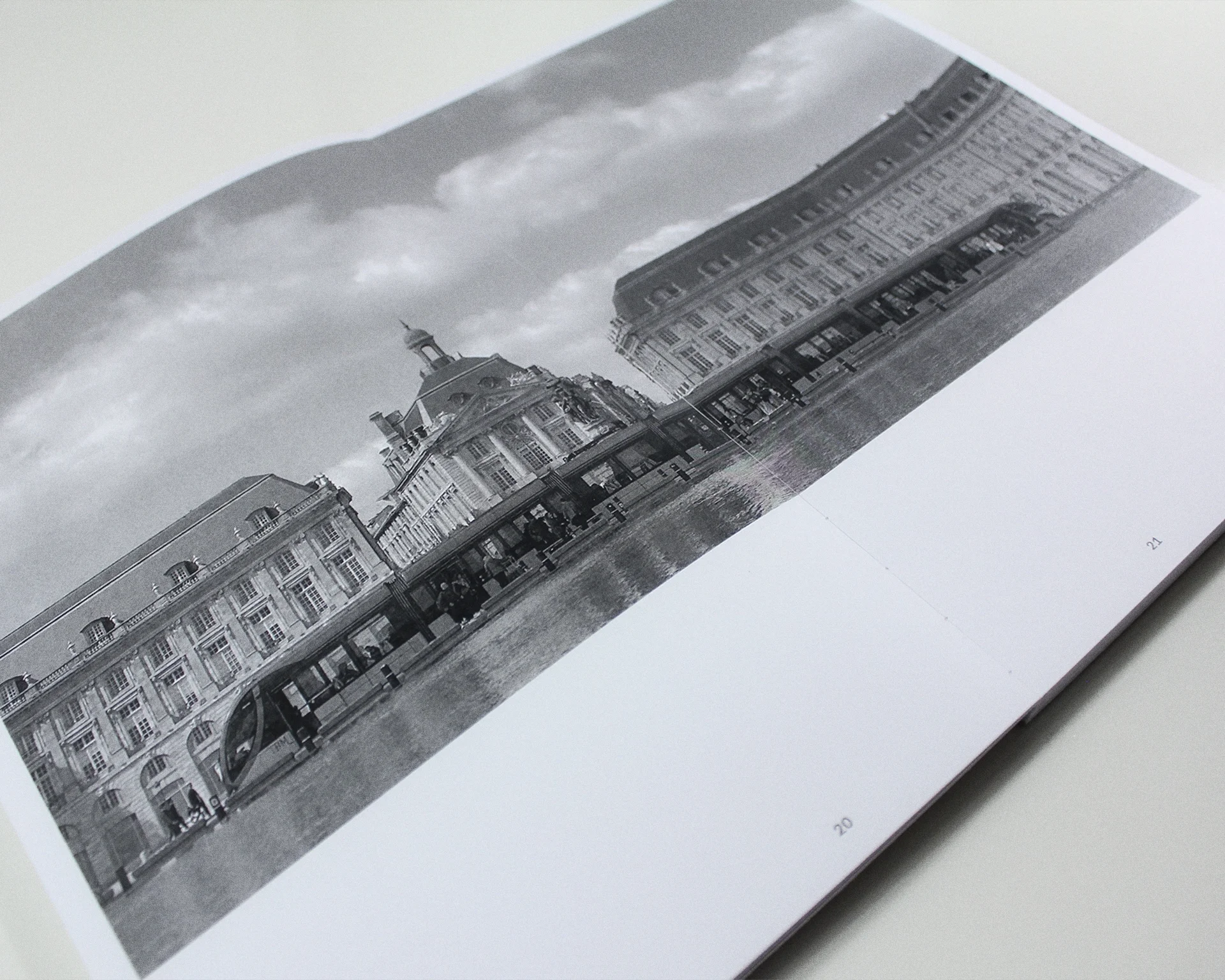
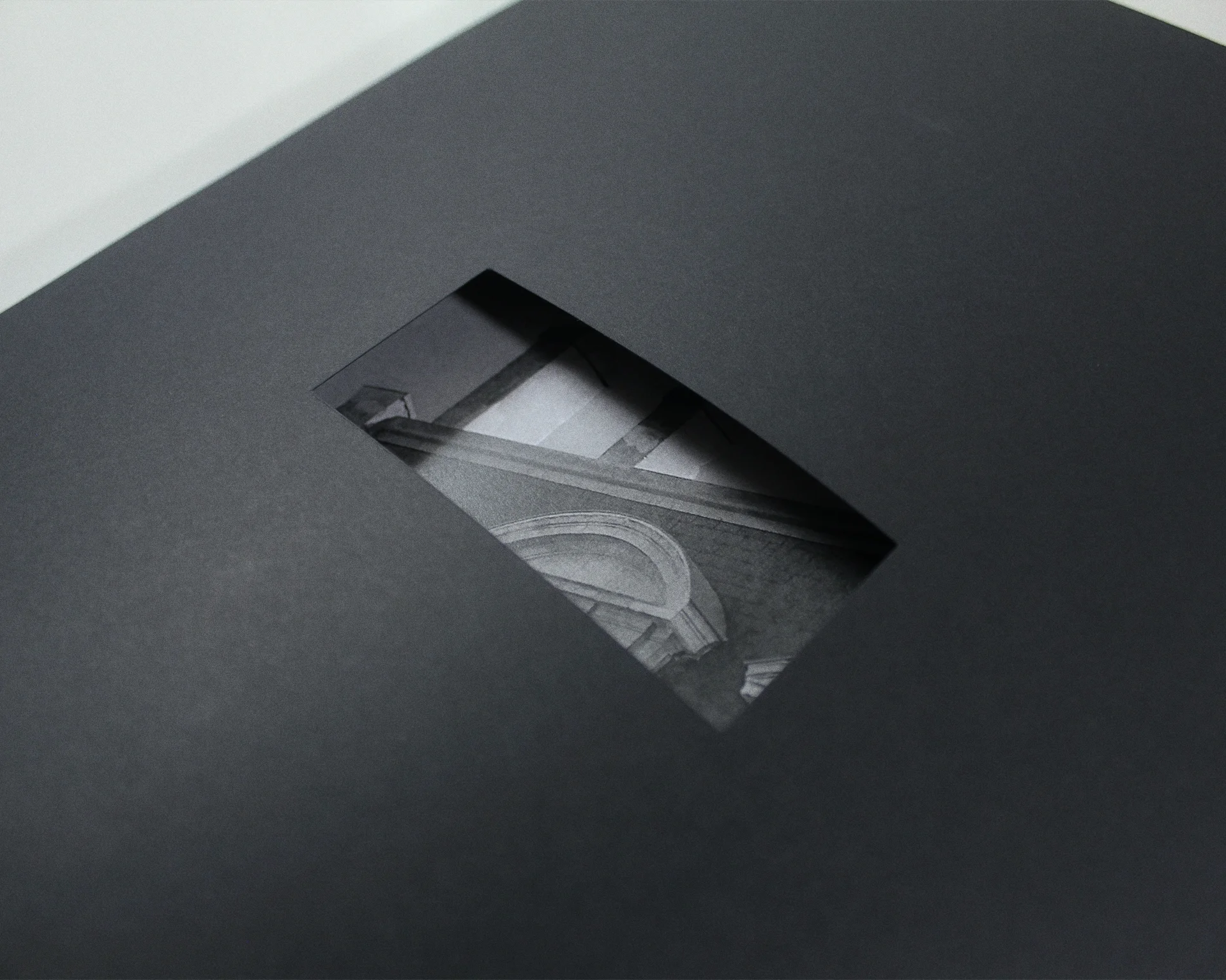
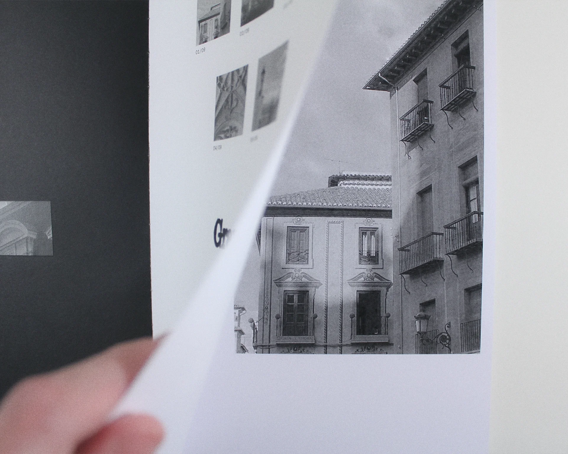
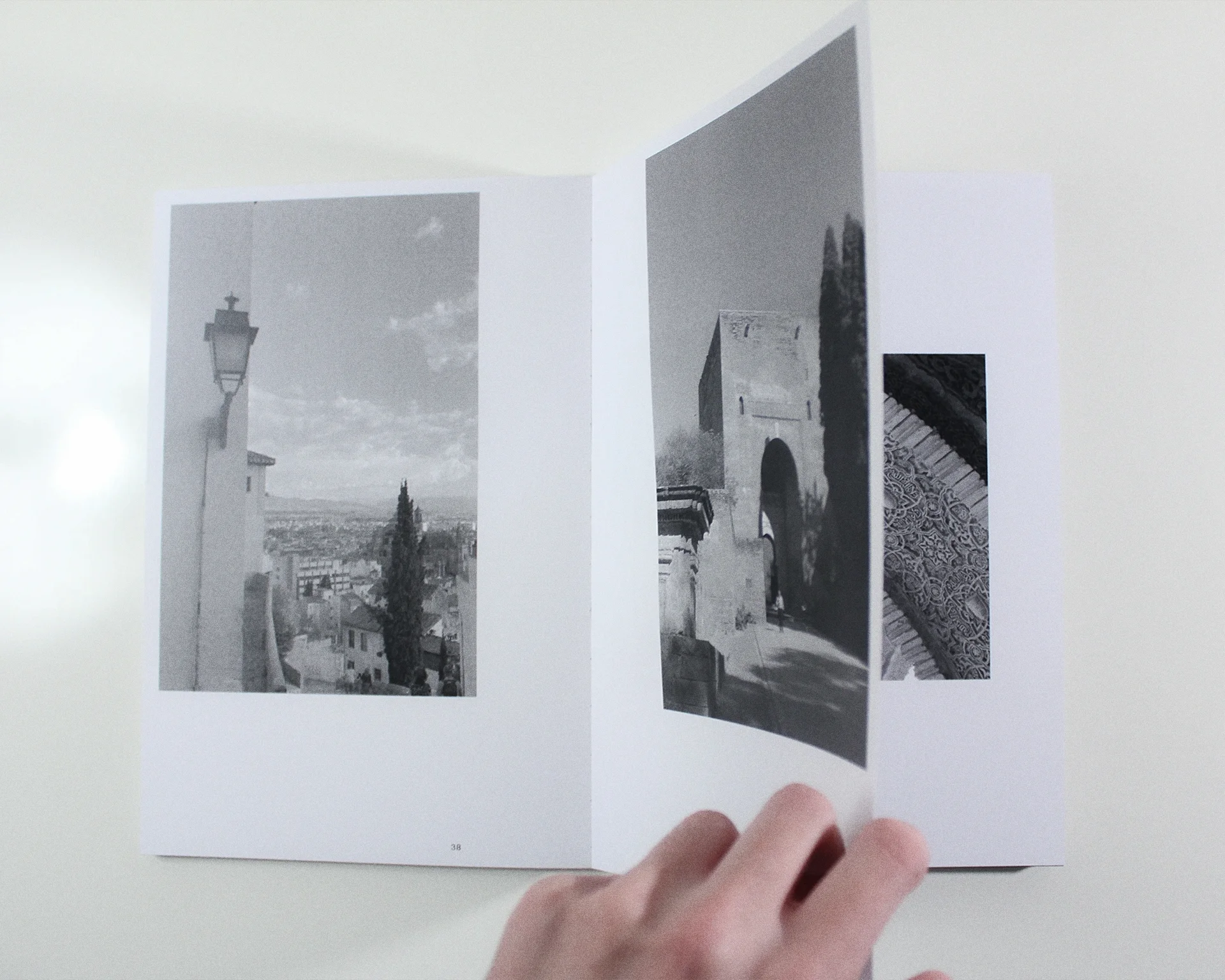
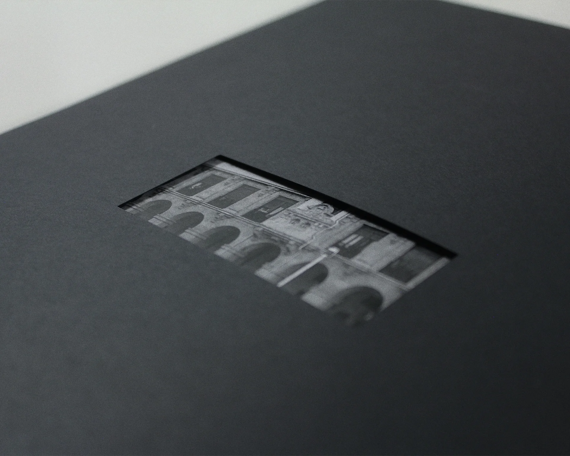
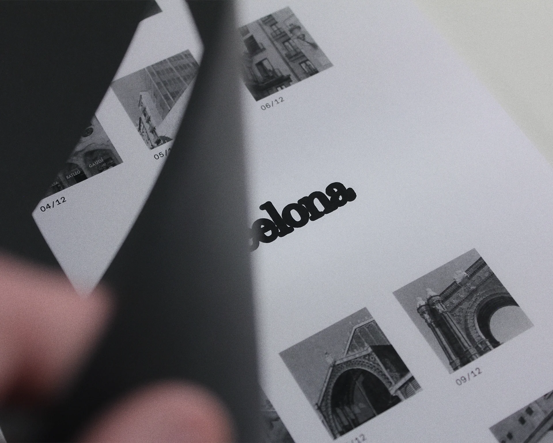
Laten book
[Book design]
02.2024
Personal project
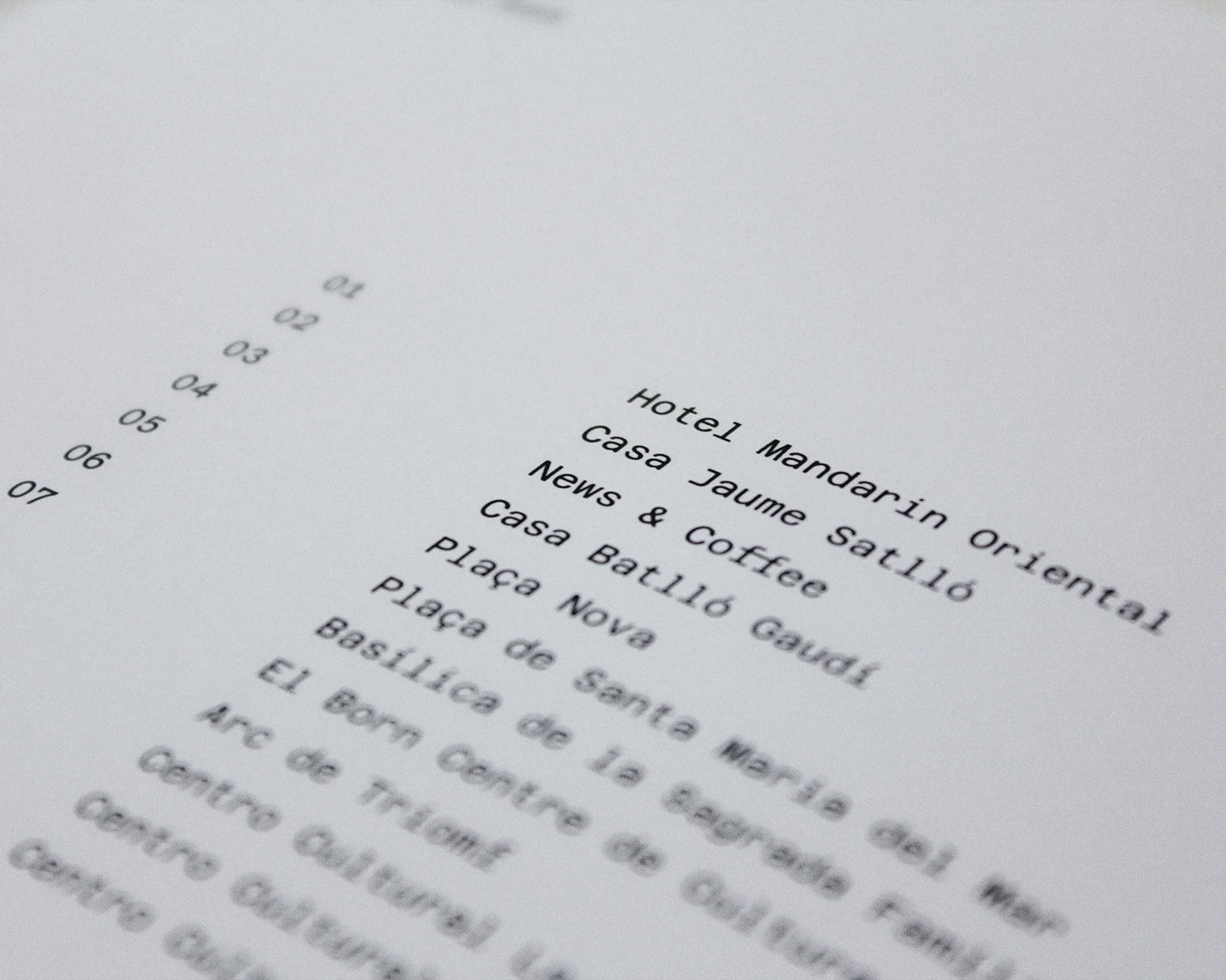
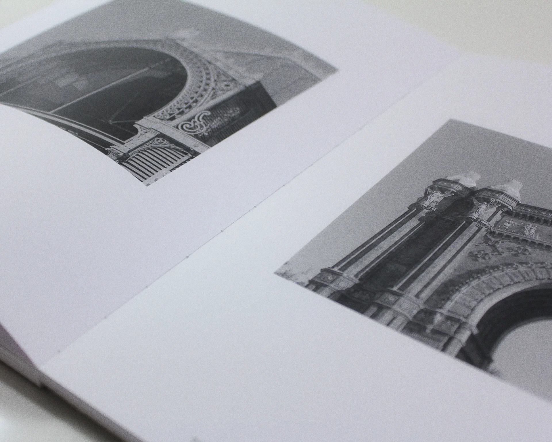
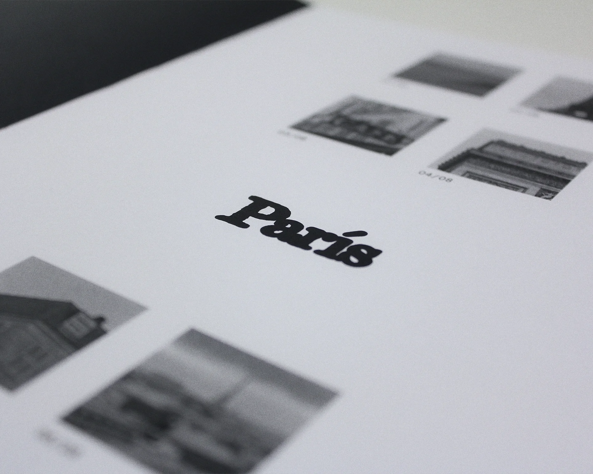
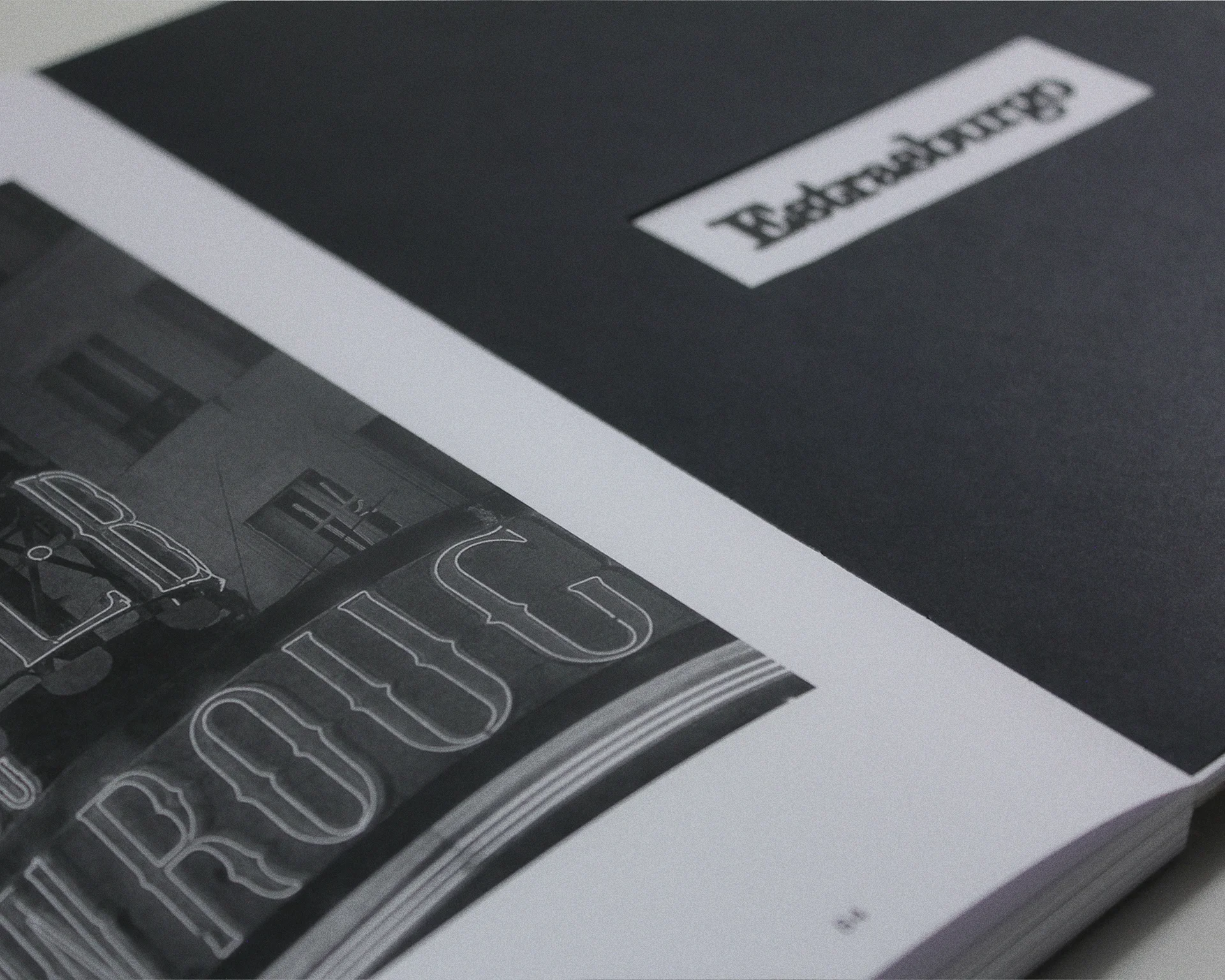
Laten is a personal collection of 74 photographs I took in different places I visited in 2023. It is easy for some images and memories to be forgotten among thousands of digital files or printed and forgotten in some drawer, so I wanted to collect in a special way some of my favourite photos and have them more accesible for when I wanted to remember some of these places.